Discover our UX/UI design for Credit Karma. We...
👀 412 views
❤️ 322 likes
In this case, you could find a detailed description
of our experience with the EHR system development.

EHR system – (electronic health record) is a software that allows doctors to view patient’s data in digital form – website or app. His or her medical history, personal information, previous visits, test results and other medical indicators and health conditions.
This industry has its origins in the 1970s when The United States Department of Veterans Affairs has launched the Decentralized Hospital Computer Program (DHCP). Prototypes of similar systems were developed and earlier. Still, only this system has received access to federal resources, which allowed it to grow and evolve. It was a massive step for EHR system development and healthcare software.
Overview (Video)
In the past 10 years, the EHR system – (electronic health record) has developed actively because this system has proven to be effective in the patient care sphere.
Nowadays, the EHR system as healthcare software allows viewing the patient’s medical information and has many additional features:creating/posting/sending invoices, writing of description and communication are also available here. In some cases, an EHR system could be used as a software for managing the work of the entire hospital.
There are many solutions for such software in the US market, as well as companies providing such services as medical app development. According to Techradar data of 2019, the top 5 most popular systems in the US were
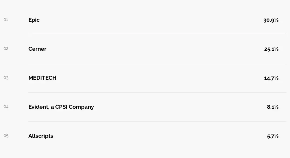
Top 5 EHR systems of 2019 according to Techradar
The Rondesignlab team has always been interested in getting into this industry, and have taken part in such an app development process.
We were interested to understand the challenges faced by doctors and their patients, and of course, the development team during the use of such electronic health record systems.
We were hired by a company (here and after we will call it Health Care Solutions or HCS), which has been working on innovations in the Health Care sector for several years in collaboration with doctors and specialists from the Health Care sector. HCS received a grant to test one hypothesis.
The HCS hypothesis was that if the data is visualized, doctors will interact faster with the program and all software opportunities.
During the research, HCS found that many modern EHR systems are not entirely focused on doctors’ needs. In turn, this may prevent doctors from providing better care for patients, and in cases when it comes to an emergency, saving many lives.
HCS challenged the Rondesignlab with a very ambitious goal to transform a lot of different data about the patient’s health into an accessible visualized view.
We should create a visualization of an EHR system that will enable the doctor to quickly explore the patient’s history, especially in urgent cases and for patients with an extensive medical history. Rondesignlab had already faced highly loaded projects, so the team quickly got to work.
As usual, any project starts with the discovery stage. The discovery allows our team to get acquainted in detail with this project, and to look at it from a different angle.
HCS challenged the Rondesignlab with a very ambitious goal to transform a lot of different data about the patient’s health into an accessible visualized view.
A lot of data in the system consists of separate files from different sources, which require a lot of time to work with.
Systems store a large amount of medical data in separate documents, making it challenging to work with them. Working with documents slows down the doctors’ work when they are reviewing medical history. During our discovery, doctors even expressed the idea that sometimes it is easier for them to print a bunch of documents and work with them, than to understand and deal with the system.
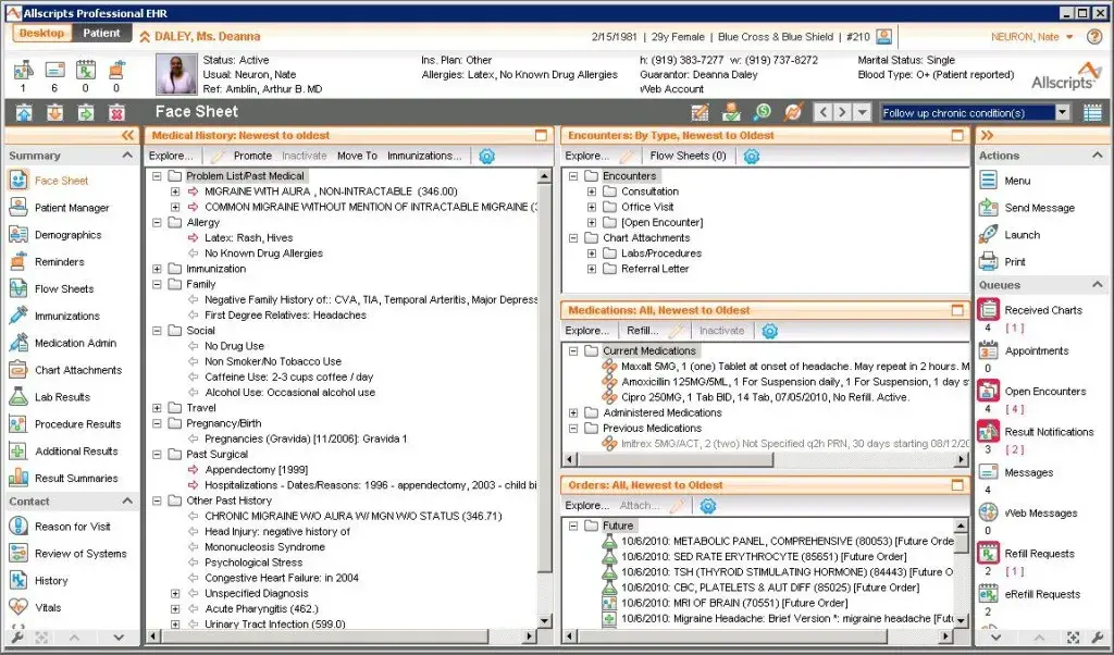
The example of EHR structure https://www.wheelhouse.com/electronic-medical-records/allscripts
The information in the programs has a complicated structure, so doctors should take a long time to analyze. There is no way to get a quick summary in this system to understand what to concentrate on.
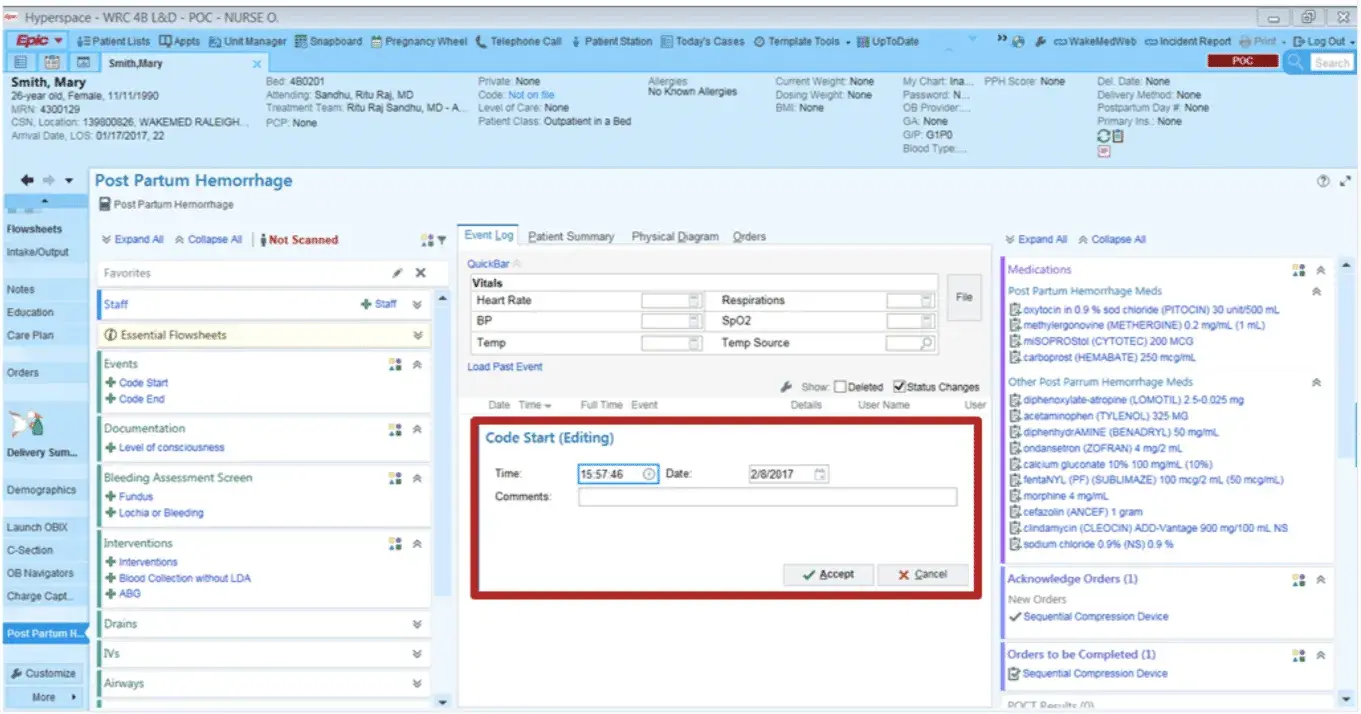
On this screenshot, you could see one of the market leaders “Epic” https://www.pqcnc.org/node/13946
Due to the small visualization and a large amount of data in text form, doctors have to read a large amount of text. This dramatically extends the acquaintance’s time.
Systems store a large amount of medical data in separate documents, making it challenging to work with them. Working with documents slows down the doctors’ work when they are reviewing medical history. During our discovery, doctors even expressed the idea that sometimes it is easier for them to print a bunch of documents and work with them, than to understand and deal with the system.
Some EHR systems are trying to fix this problem, but there are a couple of things to update.
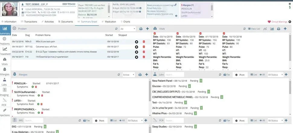
The example of Structure “AllegianceMD EMR Software” https://www.softwareadvice.com/au/medical/allegiancemd-profile
With each visit of a patient, there are many records with absolutely different information entered into the system. In the case of hospitalization, the number of informational items can grow up to 50 units. In such a flow of information, it isn’t easy to reconstruct the chronology of events and identify events that could affect health.
Sometimes it is challenging to separate essential records from less important ones.
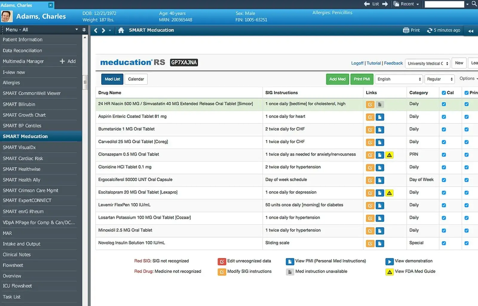
One of the market leaders “Cerner” https://technologyadvice.com/blog/healthcare/cerner-vs-epic/
For doctors, it may be hard to interact with the new functions cause they aren’t working correctly.
For example, implementing a search bar in the interface was supposed to make surfing through data intuitive. However, doctors received the function that lagged while processing the request and didn’t produce any results if an error in at least one letter had been made.
The usability of the systems needs to be improved, as there is disregard for features such as search. Sometimes doctors could ignore the functionality in favor of paper that can be printed, hung on the wall, and compared with all other data. All of this ultimately slows down the decision-making process in the treatment of patients.
Some of the data and types of information aren’t available before the patient’s visit. For example, doctors have no information about which medications a patient recently took at home. In the system, it is a simply made prescription based on a visit.
The situation is the same with well-being. Doctors are often faced with a mismatch between information in an EHR system and that provided by a patient.
The patient could complain about the pain in one of the visits, and if he or she gets to the emergency room, and he or she doesn’t remember about them. The doctor has to contact the patient to track their well-being. Not all EHR systems provide the ability to maintain such data.
Many such systems were designed before the “Mobile first” era. Therefore they don’t take into account the difference between touch devices and desktop versions.
EHR platforms aren’t designed for a tablet device. They don’t take into account their capabilities and interaction features, and also don’t use all the available functionality of modern devices. This all slows down the doctors and their work process.
During our work on this project, we have made a rule – all solutions for the system should be functional and informative, without losing data. It is essential that the doctors could get all the data at any time they need it.
It was also essential to create a clear information architecture to make it easier for doctors to familiarize themselves and work with the system.
Due to their long history and dependence on Legacy, these systems sometimes have usability problems, which in turn is critically essential for saving patients’ lives. It is hard to provide good usability without real users. That’s why after the first prototypes are ready and interviews with stakeholders were done, we always make the test the final prototype to confirm that we are heading in the right direction.
During the development of prototypes, the Stakeholder suggested making a new format of interaction with the system, which is like a timeline with quick results.
The main idea was that, in the interface, there would be a tool to view the history of patient visits, recent analyzes, and visits to the emergency. Also, the detailed view with filters by the hour, day, month, and year, depending on the doctor’s needs, will be available.
We came up with a timeline of the history of the patient, his or her visits, operations, medication prescriptions, and other medical indicators to quickly so that doctors can quickly familiarize with the entire history of the disease or restore any time slot by the minute.
Timeline with the history of visits (Video)
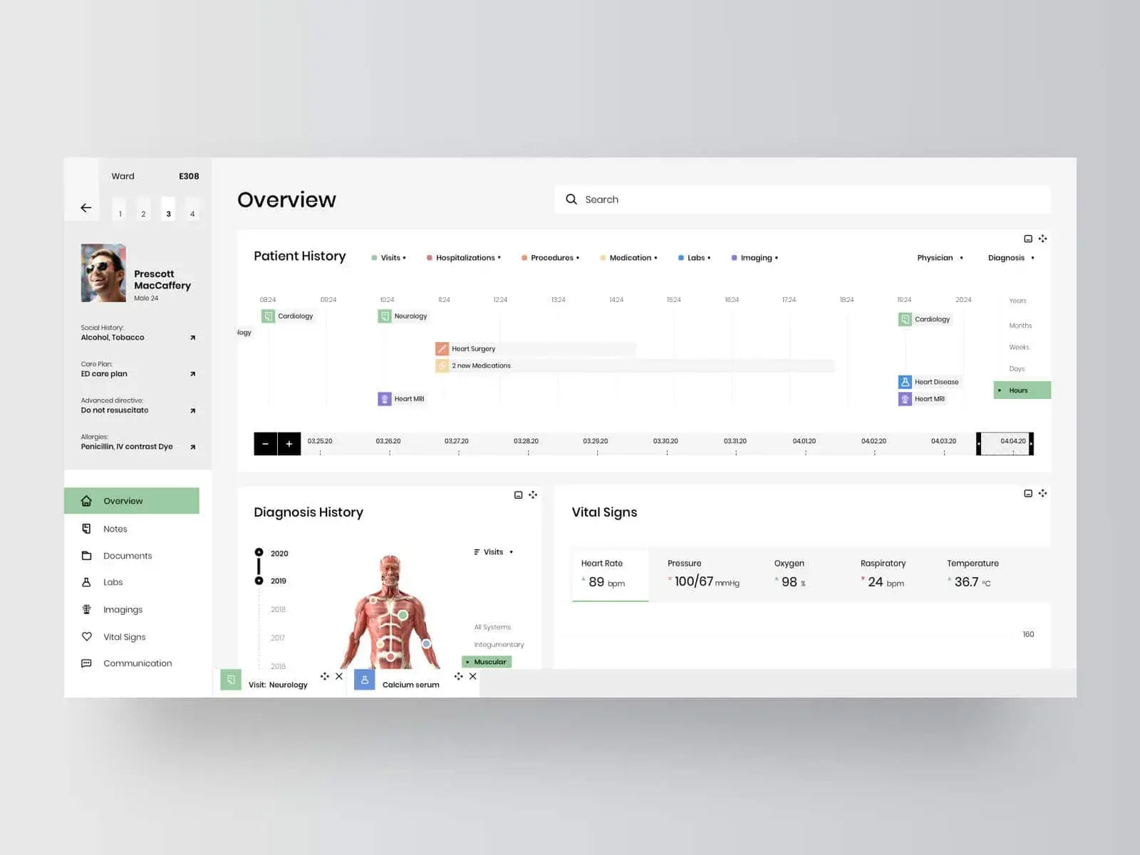
Heat Map of patient diagnoses, next iterations
The stakeholder suggested making some kind of format for block, which allows the doctor to understand primary and chronic diseases had this patient even during the first visit.
We have made the Heat Map with the diagnoses given to the patient to be able to understand what the person is sick with.
Initially, we wanted to display this data in a chart in which it would be easy for the doctor to identify the patient’s main problems quickly.
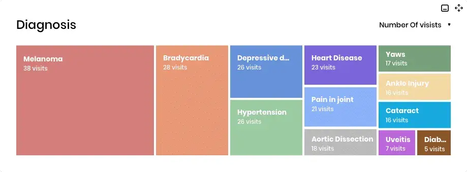
Heat Map of patient diagnoses, first iterations
The stakeholder has proposed implementing the visualization with the help of the human body, which will allow doctors to quickly understand in which system the problem is and its priority.
Heat Map of patient diagnoses, next iterations
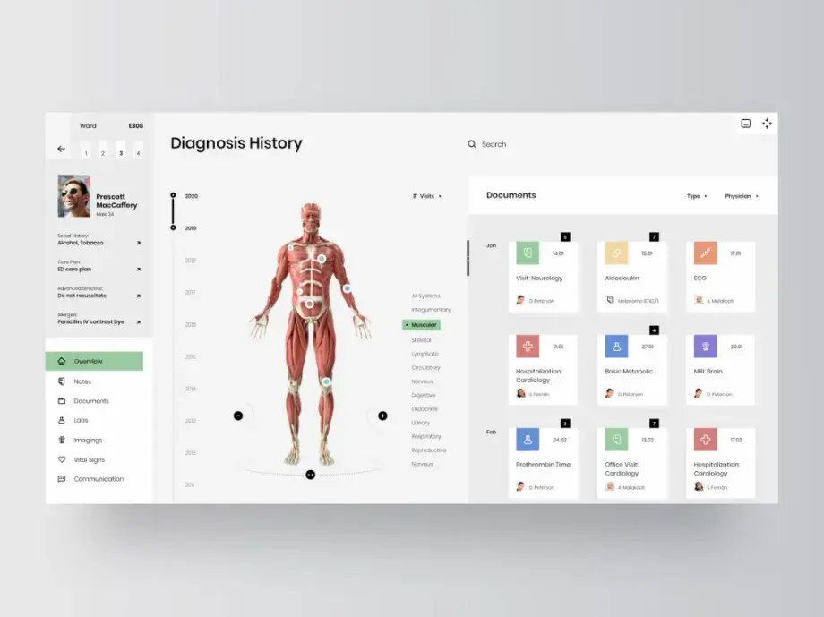
Heat Map of patient diagnoses, next iterations
The stakeholder gave us a task for a block that was supposed to solve the problem of comparing a large number of files. Cause on the original version of the platform, the best thing that could be done was to print all the data and compare it by hanging it on a board or wall.
We came up with the panel that collects all the documents for comparison. This panel makes it possible to save documents separately, and filter it by any parameters.
A system that allows doctors to save the files that they need and quickly view them (Video)
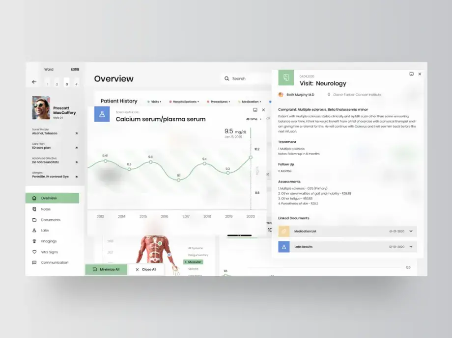
A system that allows doctors to save the files that they need and quickly view them
As part of the project, we decided to make the additional interaction between the doctor and the patient outside the hospital, monitor his/her health, and take medications. We have created an app where the patient will be able to tell about their well-being and get in touch with a doctor and make an appointment.
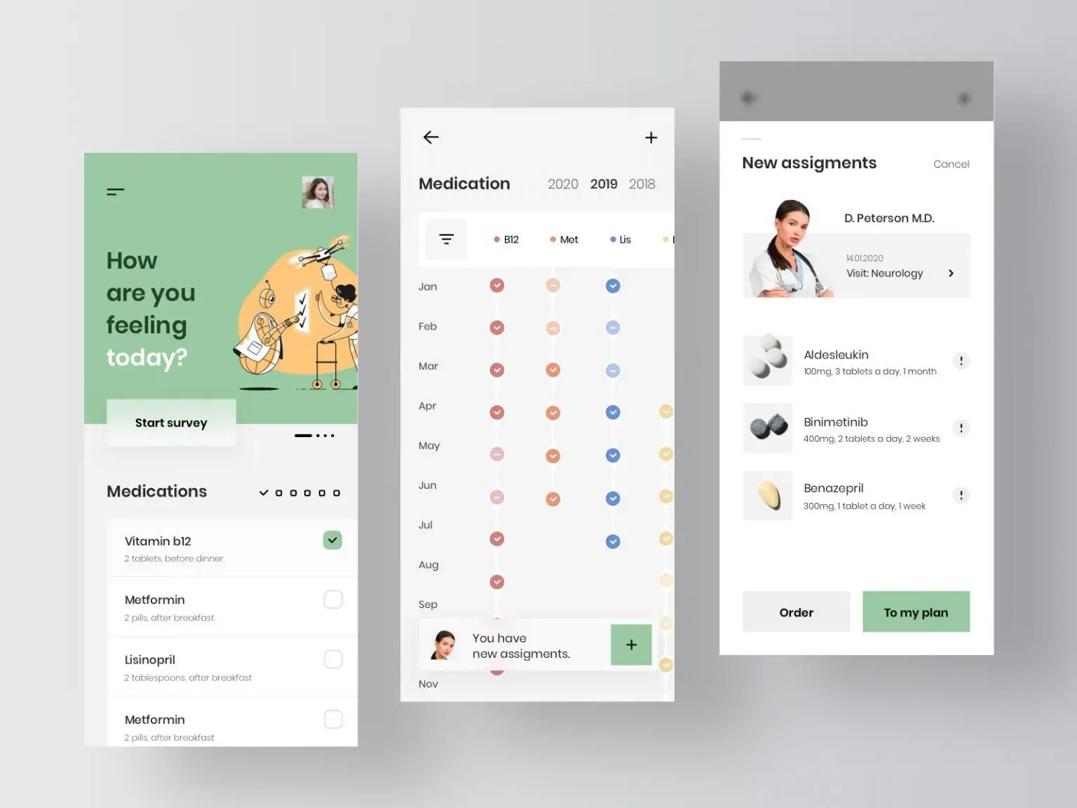
A couple of screens as part of the EHR system for the patient
One of the tasks for us was the clear architecture for the side of the documents, which will explain how documents are related to each other.
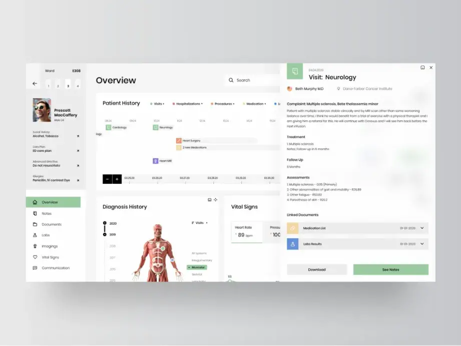
A system that allows doctors to save the files that they need and quickly view them
As part of the work on EHR systems, it is periodically necessary to compare laboratory tests. Doctors could need to look at individual results, decide how they changed during treatment, and evaluate general indicators during the emergency.
The stakeholder has initiated rethinking the lab analysis page to be viewed quickly and easily within the interface.
A quick view of the analysis filtered by one parameter (Video)
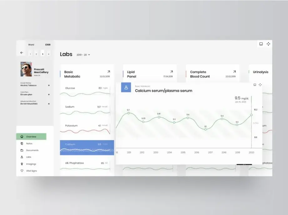
A quick view of the analysis filtered by one parameter
We did our best to adapt the interface so that the system can easily and clearly work on tablets and desktop devices.
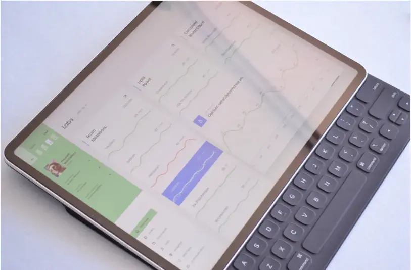
We have created a visual architecture that, at a glance, helps the user to identify the interactive elements and the ones that are of primary interest.
We strictly adhere to the rules of accessibility and therefore paid particular attention to the contrast of the color scheme. So that all essential information about the patient and the interactive elements could be easily identified by doctors’ eye.
We also didn’t want the interface to be too overloaded because it would complicate doctors and medical staff’s work. Layout interaction was designed in that way, so the doctor can focus as much as possible on the information that is important for them right now. For this, we have made “floating” layouts.
During the first test sessions, the prototype performed well. And at this point, our task was completed. The rest of the project on our customer has finished on their own as they had more development stages to go through.
This is not our first experience working on highly loaded systems or enterprise projects, such as SaaS solutions or Big Data. But we consider this experience to be one of the most important ones. It allowed us to work with interfaces on which people’s lives depended and see what problems their users face.
We made sure that we can work with such projects, and the team has a sufficient background to conduct the discovery and design of such systems.
Special thanks to the HCS team for allowing us to get such experience and opportunity to work on such projects.
Shall we chat?
[email protected]Let’s

talk