
Inside Job: Samsung Internal System Design
Samsung OS - Software Development & UI UX...
👀 4178 views
❤️ 414 likes
MroSupply — is the company that has been selling industrial goods since 1898. The website mrosupply.com is more than 6 years old now, at the moment it has more than 200 brands and 700 000 available products for purchasing. Among their regular customers are such brands as Coca Cola, 7up, United, Whole Foods, Hormel Foods and many others.
Within this project, we created the entire visual part for the user. The list of works includes such services as:
So, in fact, we did all the work except Back-End development, as far as the customer had his own team that has been working on this project for a long time.
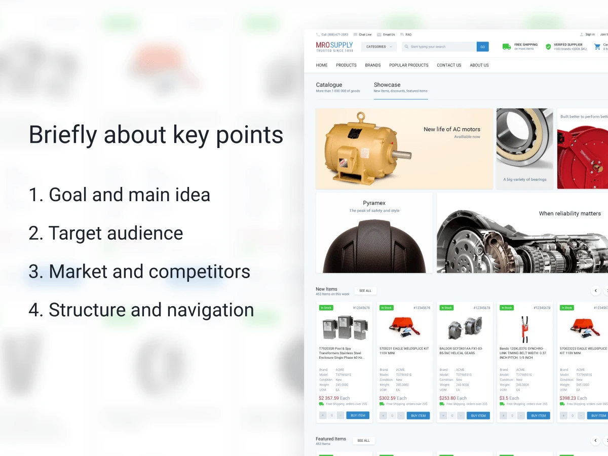
Main theses of the case
As far as the client’s goals quite often diverge with the goals of the project, we divided them. This works well in case we need to remake the ready-made project.
Initially the client did not have the clear brief, he had an understanding and list of mandatory requirements for improvement. The list included such items as:
As long as the company and the client are actively engaged in analytics and marketing, they were interested to see the look from the outside. It means, to see our Research and proposed solutions. The principal ones were:
The market of the website is quite wide. The main target audience are employees of companies who purchase equipment using stationary computers installed at their working places.
The market is quite wide. There are not many competitors, but those who are have quite strong positions. Problems of all competitors are different (delivery, description of goods, the ability to quick issue of goods).
The Client did not want to change a lot of navigation on the website, because it would hit the sales much, due to the fact that the current audience of the website is not active Internet users and any changes can confuse.
There were also a few items such as problems with complicated registration and ordering on the website. These problems had to be corrected.
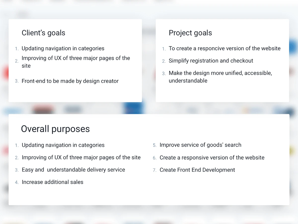
Table with goals of the client, project goals and overall purposes
Overall purposes
During the existence of the project the Client has accumulated a critical mass of problems, according to SEO, the functions that does not reply to current requirements anymore. It was decided to redesign the website in accordance with new goals.
With the developing of the website number of categories was greatly increased and the previous design could not display them in a user-friendly form.
As it is known there are 4 key pages in e-Commerce websites (home page, product listing, product page, checkout) where users spend most of their time and which have strong influence on sales. The client experimented quite a lot with the first three and he had a vision of how they should look.
One of requirements of the Client was that the front-end should be done exactly by same person who made the design. The client reasoned his decision by the fact that same person clearly understands how the project should be look like from a technical point of view.
During the research, we learned that the project has quite a few other goals that would be useful for users.
It turned out that a wide number of users are viewing the website with a low resolution. The current website is designed for a minimum resolution of only 1000px, which means that users with a lower screen resolution are already experiencing difficulties in using the website. Also the responsive version affects SEO promotion very well. Google has recently reduced positions of websites, which has no mobile version.
During the study of the MroSupply website, we realized that in comparison to competitors, it has poor realization of additional sales.
After analysing the website, we came to conclusion that the user is slightly involved in the process of buying and interacting with the website.
For example, after completing registration there is no notification that the user has been registered on the website. If the Cart contains unissued goods, the website does not remind about this by mail, for user to complete the order. No notifications come to email after changing the status of the order.
There are many mentions on the website, that if you make an order for a certain amount, then the delivery will be free of charge. Users complained that it is not obvious to them how free shipping is calculated. We offered the client to complete this function, and also it is possible to make a mobile application where you can see the status of delivery.
Usually during the disputing and after the results of our research, the customer’s goals are changed in accordance to new information. In a result, the list of goals for us looked like this:
During the dialogue, we learned some important details:
As the variety of users in the project is very wide, we decided that it makes sense to highlight the main features of the target audience.
1. Most users view the website with devices with low resolution.
From the customer, we learned that 11% of users use IE8, and Windows XP. Basing on this information, it can be assumed that users buy products on the website from work devices.
2. Like to call directly to the support service to place an order.
The audience of the website is quite adult 25+.
3. They know about the website in offline.
From the customer, we learned that users mostly visit the website by a direct link and they use only search.
So, we can conclude that the audience of the website is not active Internet users. They use it on a big need. Do not really like to understand new technologies. They love constancy, they do not like changes. The customer, from his side, several times underlined the fact that we should not change the structure of the website, because the user may be confused.
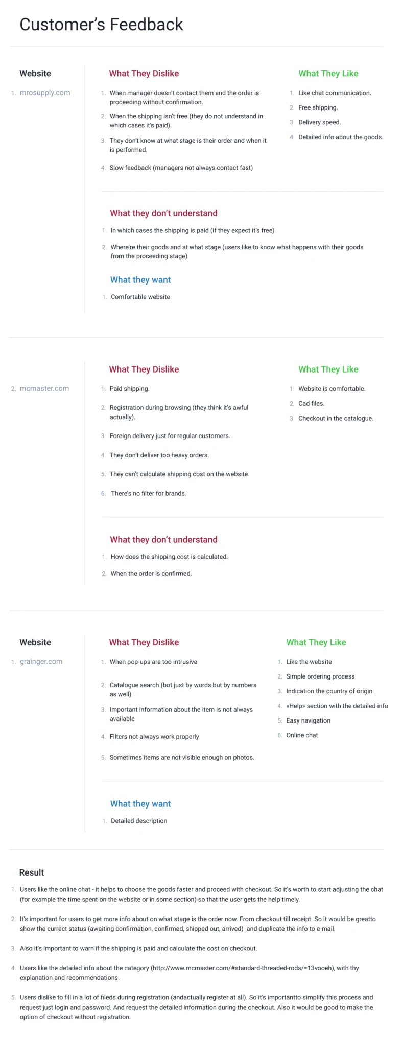
Small clippings from the Research
During the research we found out that the market in the industry is wide (an average of 7 million users per month), these are mainly businesses related to the US light industry such as:
As initially we had not much time for the research, we have analyzed just the two websited from the TOP-5 in this industry.
These websites are very different in content, but they have their own problems, advantages and disadvantages to each other.
1. The common thing between two websites was that it’s important for users to see the detailed description of the products on the website.
2. It is important for users that the delivery is transparent and calculated at the stage of order checkout.
3. There were many MroSupply reviews regarding untimely registration, for example on one website user has to register in order to enter it.
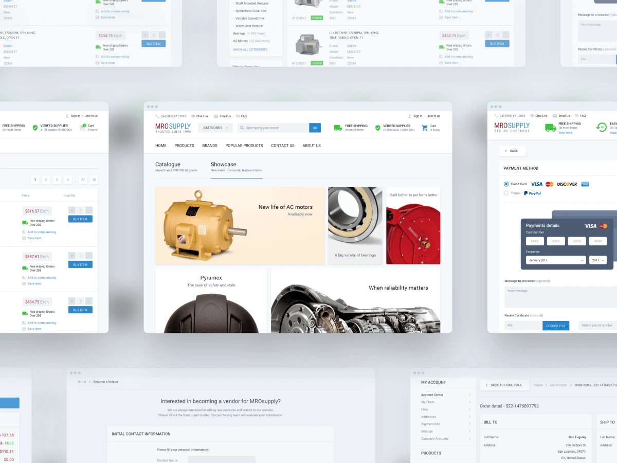
Main screens of the website
According to customer’s request, the current structure has not been changed. The customer underlined his vision with several factors.
1. Current users do not really like changes and if they (changes) are global, then the audience can be confused.
2. This is not very good for SEO. Re-indexing can greatly reduce the website’s position in the search results (now it’s more than 50,000 users per month).
In general, the website has fairly clear structure, but the content was displayed in kind of chaotic manner, so we mainly dealt with the refinement of what already existed, and expanded the functionality according to new requirements.
There also were few items on the website that needed to be fixed.
The first item was connected with the registration. To register on the website, it was necessary to fill up a huge form, which has an auto-check in all fields.
Users told about this inconvenience directly. That’s why, at the first stage, we decided that the user would fill up a simple form with several fields. And after he begins ordering goods, propose to fill a large form with all the necessary fields. This solves two problems at once, the first one — the user does not need to bother about filling out long forms at the beginning, the second is that the website will be able to send a reminder to the user by mail about the product left in the Cart.
The second item was connected with the Cart. Since it was not in sight, and there were a lot of goods in it, it was necessary to make sure that the user could always keep it in sight; therefore, at the request of the customer, it was made similar to the Cart at www.jet.com, so user can always see the list of his goods.
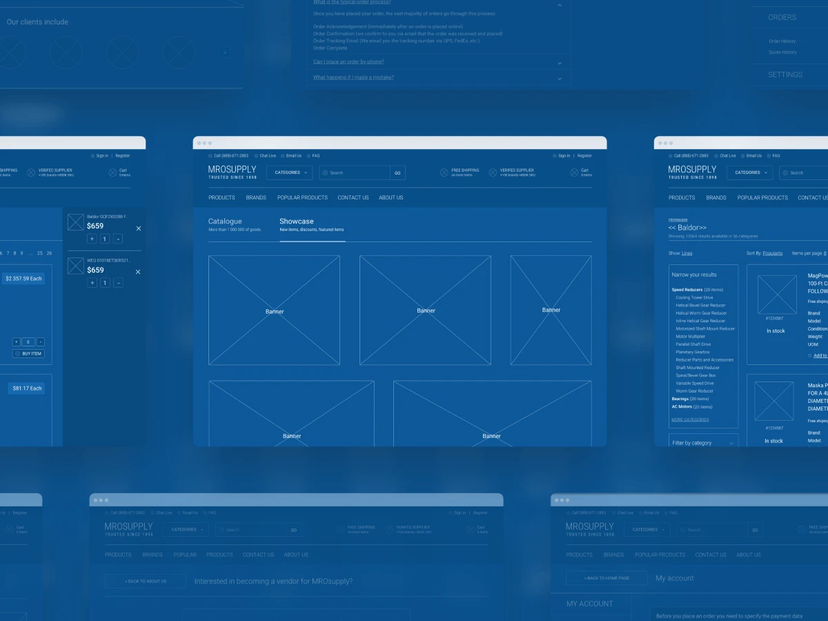
Wireframes for the customer
Wireframing is one of the key steps in creation of a project. At this stage, according to the data collected from the research, and also from the customer, we prepare the frame of the future page, with all the improvements and new functionality. At this step, we agree on all the important details of the future website.
Most of our work at this stage is connected with a tool called Invisionapp. In Invisionapp, you can agree and discuss with the customer all visual details of future product. The service has a fairly simple and forceful prototyping tool, which helps to create a linked (clickable) prototype at the wireframes stage.
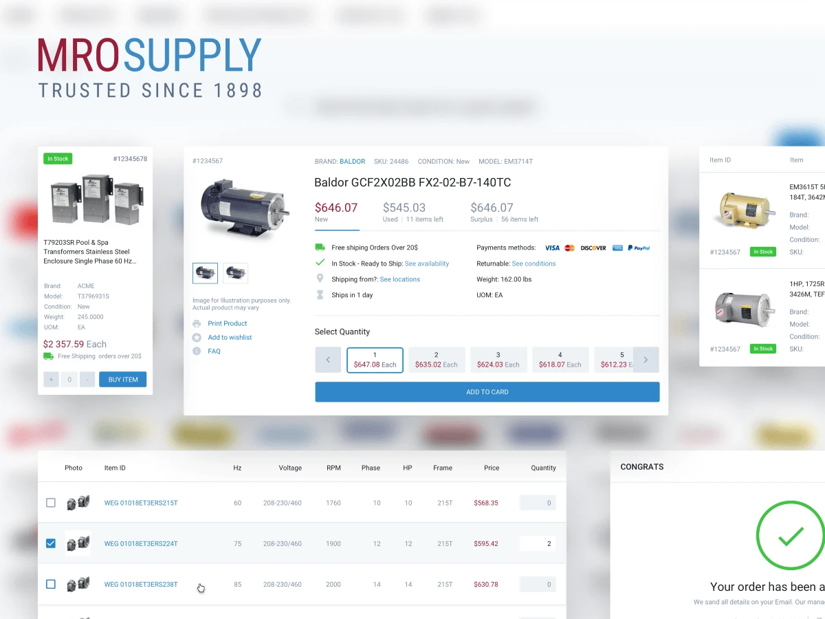
Ui Elements
During the short discussion with the customer it was decided to make the website in the Material Style. This decision was determined by several factors.
1. The material style has its own guidelines, which Google created specifically for developers. If the design has some gaps like loaders, errors, they can easily be filled by looking at native guidelines.
2. Material style is quite universal and understandable; it has standard patterns of interaction with the interface.
3. Material style is dynamic. Since our future website will be simple, the animation should give additional vision to the user about how these or other functions work.
4. The material is familiar to millions of people. Reminding that website users do not particularly like changes, there is a high probability that they have already faced this system and the experience of interacting with the updated website will be much easier.
5. In material style there are a lot of source files like icons, fonts, and animations. These files are of high quality and can significantly save time when creating a new design and front-end part, and also optimize the speed of the website loading.
Colors & fonts
With the palette as well as with font we decided not to be tricky, we took the basic colours from the previous website, and added shades of grey to highlight the accents. As a new font on the website decided to choose Roboto. The font is optimized for high and low resolutions and generally is quite readable.
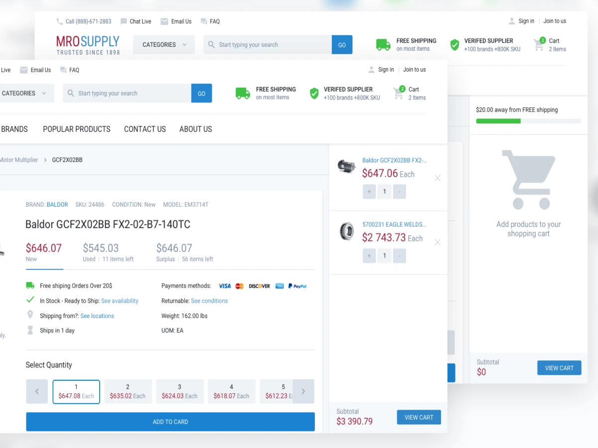
Display of an empty and full cart
At the beginning of the project, customer said that he needed a Cart like on the website jet.com. In this project, users, while ordering goods, have a large number of items in the Cart. On the old website, you couldn’t view and edit the shopping Cart while purchasing. It was necessary to switch all the time between the Cart and the website. We realized the possibility of browsing the Cart from each page. Also, it was unclear for users how the delivery works on the website, we added a delivery block to the Cart to make it clearly visible how many goods you need to order to receive a free shipping.
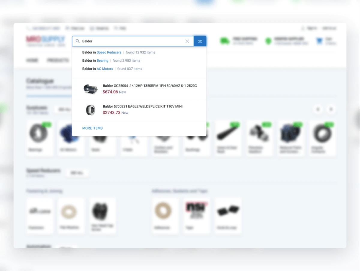
Display of search operation
We learned from the customer, that on the website users use mainly search and product page. We focused especial attention on these points. When you enter text in the search bar, the website looks for matches on all words in the title and description of the product, and also in categories
Product page
On the MroSupply, the product page is the second most visited page on the website. It underwent biggest changes, as many new functions have been added to the page.
1. Now on the website there is an opportunity to buy used goods, as well as surpluses that cost significantly cheaper.
2. Select the required number of products with one click.
3. The block of alternative goods has undergone some changes, now alternative products can be added directly from the product page.
We moved the extra information (about delivery, availability, presence) lower to another block. The customer asked to return it to the main screen, because it answers 95% of questions that come to the call centre from users and, accordingly, this information reduce its occupancy.
Also an interesting fact was that, after adding icons of payment systems which website accepts on the product page, sales increased by $ 10,000 per day.
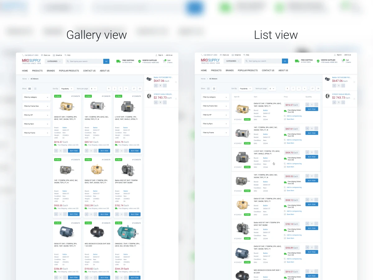
Catalog page V1 and V2
On catalogue page, the main task was to display as many goods as possible on the screen. During the development, we came to two product displays, gallery and list. When displaying as a gallery, on the page, more goods are placed, but the list of goods is more readable. Also, currently goods on the website are displayed in a list and users got used to such a view.
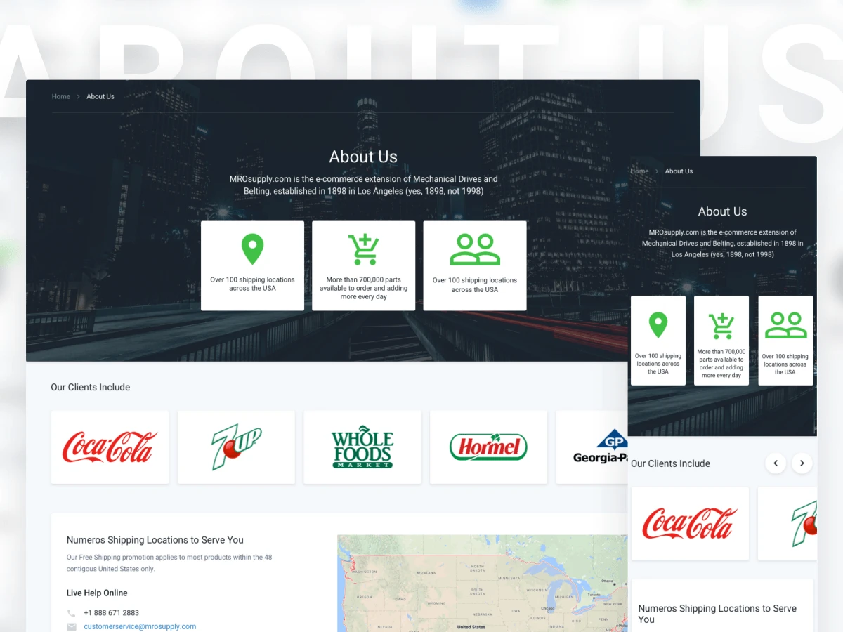
Page About Us
Before, on the MROsupply website, an information about the company was scattered across several pages and was not as clear as it is now. Now on this page all the necessary information for users indicated more clearly.

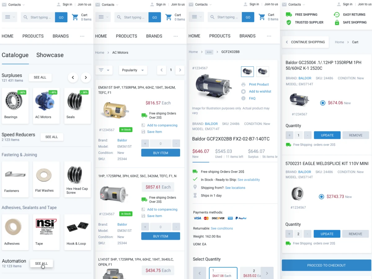
Pages of the mobile version of the website
It’s interesting that, no any competitor has a mobile version of the website, but they have several applications on App Store and Play Market.
In our project one of the main tasks was to make the website responsive, because it is useful for SEO, and also because many users come to the website from mobile devices. The minimum width for the mobile decided to be 320px. Mobile version of the website by its functional is 100% corresponds to the desktop.
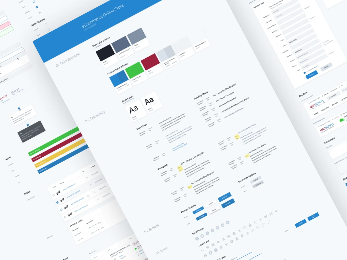
Guideline for Mro Supply
Traditionally, at the end of each project, we prepare a technical assignment for developers. This list includes:
1. Guideline with all the details of future design.
2. Interaction with an interface in tricky places.
3. Animation of interface for a more understandable mechanics of the future website.
4. Formulas, calculations that will be used in the work.
In fact, this document should answer 90% of questions of the team that will continue to work on this project.
In this project, we made Front-End development. Most of the points from the list above were not needed. We just made detailed Guideline of the website, for developers to have a visual file of the website’s styles.
Of course, this is not the end of the work. After the design is updated, there are always a lot of bugs that need to be fixed. When the work on the initial corrections is completed, the process will be more smooth and systematic.
The case described above is an example of how we work in our studio. We constantly work on this process and try to make it better, more efficient and more convenient for the customer.
Also we want to mention that in this project we made the front-end and we are satisfied with its quality very much. Often, at the stage of transferring the design to the customer’s front-end team, quality deteriorates. Usually this is not due to team skills, but due to misunderstanding of mechanics of the work of future website. Therefore, we recommend that if you do not order the front-end to the same developer who made the design, then at least arrange the communication between designers and front-end developers.
Also you can find us in social networks.
Shall we chat?
[email protected]Let’s

talk