Vessel Wellness - Habits & Health Tracker & UX UI Design
We need a health-tracking app that combines fitness, nutrition, sleep and mental health with personalized insights in one simple interface.
Jon Carder
CEO of Vessel
About the project
The goal was to upgrade the design to Vessel's new brand guidelines.
The new Vessel Wellness simplifies the user journey with immersive animations and transitions to enhance brand connection.
Project
Vessel Wellness
Discovery
UX/UI Design
Industry
Healthcare
Year
2023
Information Architecture UX Design | UX & UI Design
Project Overview
Switch from Bloom brand identity to new brand Vessel
Our key task was to reskin the Vessel creating WOW user experience. Upgrade the design to Vessel new brand guidelines and simplify the user experience using animations and transitions that draw the user into an immersive experience and further connect the user to the brand.
SaaS Development | UX & UI Design
From user needs to market gaps
We had a brainstorming and stakeholder interview session to help us analyze some of the feedback that was gotten from the clients team.
We also analyzed the competitors and the websites with the designs that the client was keen on.
60h
Look and Feel concept
15h
Stakeholder interview
10h
Moodboard creating
7h
Competitor analysis
Review UX | UX & UI Design
Target Audience
Creating User personas
The research results provided important information about the Vessel audience - people that care about their health and nutrition.
It is someone who exercises regularly and focuses on a healthy diet. Users who are already tracking their data: steps, heart rate, sleep, etc. and want to improve or optimize their health.
- “
I want to improve my health and wellness.
Liam Harper
Copywriter, Sportsman
- “
I wish I had more fresh vegetables to eat them.
Alice Moor
Designer, Vegetarian
Key insights
01 - Goals
Dave`s goal is to stay fit and healthy by eating nutritious food for longevity.
Alice is trying new vegan options every week and exploring exotic vegetables to diversify my diet.02 - Pain Points
Dave has a distaste for meat and is concerned about eating healthy and organic, but often ends up over-purchasing, which leads to food waste.
Alice focuses on preparing healthy, balanced meals, but her kid dislikes vegetables and has food allergies, and she tends to run out of fresh fruits and veggies quickly.
Analytics Review UX | UX & UI Design
Moodboard
Visual References
We drew from natural simplicity to craft the app’s interface with clean shapes and minimalist accents, organic ingredient textures, authentic and joyful expressions.
The result is a light, natural aesthetic that enhances user experience with effortless beauty.
Body Aesthetic
Vessel’s visual style for nude brand photography should feel minimalistic and aspirational, yet remain clean and bright. Nude portraits should be shot from tasteful and interesting angles to show the body
Macro Textures
Photography of macro textures include a huge amount of ingredients and food close up detail shots. The cropping and lighting for these detailed images should be associated with nature and health.
Portraits expression
The expression of the portraits should feel optimistic, natural and in the moment. It is important to capture genuine moments and expressions.
UI Design | UX & UI Design
Typography
Suitable font pair
For this project, we chose a combination of Banana and Noe Book typefaces to strike a balance between modern character and emotional warmth.
Banana, used for headlines, adds a friendly and relaxed sense with its soft, rounded forms, making it ideal for accents.
The body text font, Noe Book brings clarity and structure with its elegant design. Together, these two fonts create a harmonious visual language that blends style with readability.
Vessel Wellness - Habits & Health Tracker | UX & UI Design
Сolor palette
Freshness and naturalness in UI solution
The Vessel color palette is designed to feel fresh and clean. It is elevated and inviting. The mix of warm and cool hues in a variety of different shades allows for visual flexibility and contrast. The color palette of the Vessel consists of natural colors of vegetables and fruits.
Vessel Wellness - Habits & Health Tracker | UX & UI Design
Conceptual design
Look and Feel Concept
To understand that we are on the same page with a stakeholder, we have made the “Look and feel” concept with new design.
We developed three design concept options for the Main Screen featuring the Wellness Score and To-Do’s. Each explores a unique layout and visual approach to balance motivation, clarity, and ease of daily tracking.
Digital Transformation In Healthcare | UX & UI Design
User Flow
Guided wellness journey
The user flow illustrates how users move through the app, focusing on key sections: Home, Food Plan, Wellness Plan, Take a Test, and My Account. We have highlight the most important actions that influence the ways users interact with the product, affecting the ease of use and efficiency.
Vessel Wellness - Habits & Health Tracker | UX & UI Design
Wireframes
From Concept to Sketch
Wireframes are the skeleton view of the app that allow us to focus on key functions, elements, and actions to improve the usability before starting to reskin the app.
Vessel Wellness - Habits & Health Tracker | UX & UI Design
Vessel Wellness | UX & UI Design
Design components
Cards Framework
After conducting a detailed research we found out that the smallest delays cause rejection of the product. This led us to design a responsive, intuitive interface that supports smooth, focused interaction at every step.
Digital Healthcare | UX & UI Design
New Product Development Services | UX & UI Design
Problem statement
Scanning Problem
The problem we faced during the scanning was that some users didn't understand how to scan the card in the right way. There were some issues with lights, crop and shadows.
Solutions
01 - Smart Scan Guide
We need to make the scanning instruction flow for the user to make them better understand what they should do and explain in what way they need to scan the card.
02 - Clear recommendations
Card needs to be well lit, without shadows, droplets or any glare or bright reflections on any part of it.
AI Healthcare | UX & UI Design
Usability testing
Main page iterations
After taking a test, the user will get results. Vessel use essential health metrics like nutrition, hydration, and stress levels to help make you feel, perform and look better by helping you get rid of toxins and stress.
The key task was to show 11 goals results on one page in a compact and accurate way.
Key Features
We've taken the findings from the usability test and have iterated the design to improve the user experience. We came up with 55 iterations of this screen to make it easy to use and understand.
How it works
We have made the tabs with all goals on the first main graph. Switching between the tabs changes the graph indicators and content under the graph because it shows every specific goal information.
AI In Healthcare Companies | UX & UI Design
Medical Product Design | UX & UI Design
Usability testing
Cards iterations
At first the tests result cards were large and had pictures, but in the process we’ve made them smaller in order to show more results and fit above the fold.
Key insights
The card has been transformed a lot of times because of different functions and information that stakeholder wanted to put inside it. We need to fit more content above the fold. We have decreased the cards height to fit more cards on one screen.
Wellness Graph
All blocks changes were made with a goal to show more functions in less space to make more content fit above the fold.
Using AI In Healthcare | UX & UI Design
AI In The Healthcare Industry | UX & UI Design
Reviews
Famous people about Vessel
Vessel Wellness - Mobile App project has strong support from incredible leaders in different areas like sport and health. For example Dave Asprey - an American entrepreneur and author, creator of Bulletproof Coffee and the Bulletproof diet to biohack the life.
- “
Seeing my results motivates me to keep doing stuff that works, and to stop wasting time on stuff that doesn't.
Dave Asprey
American entrepreneur and author
Vessel Wellness - Habits & Health Tracker | UX & UI Design
Usability testing
Card improvements
All blocks changes were made with a goal to show more functions in less space to make more content fit above the fold. We need to fit more content above the fold. We have decreased the cards height to fit more cards on one screen.
Key insights
The card has been transformed a lot of times because of different functions and information that stakeholder wanted to put inside it.
Stress Relief Activity
We have change the spacing to shrink the text first and after that have decreased the amount of text to fit more cards on one screen.
Mobile Application Design | UX & UI Design
Usability testing
One card changes
The card has been transformed a lot of times because of different functions and information that stakeholder wanted to put inside it.
We explored multiple design iterations to balance usability, visual clarity, and content hierarchy — ensuring the final version communicates essential data without overwhelming the user.
Mobile App Design | UX & UI Design
UI design of page
Food Plan
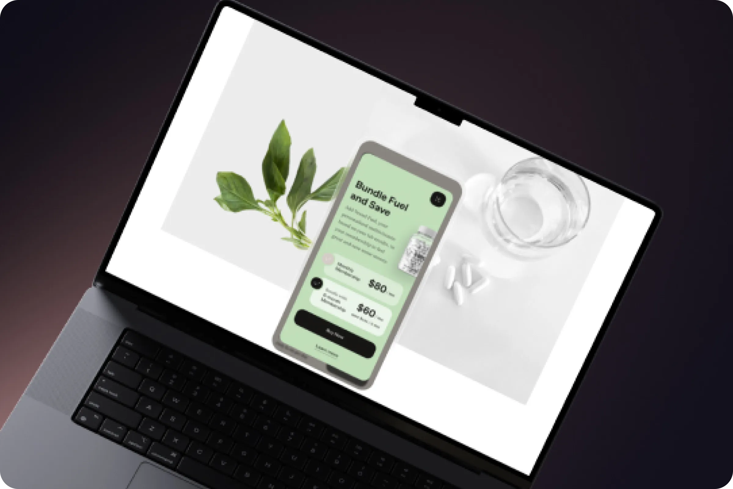
Pick the food you'll actually eat if you do not like supplements, then Vessel gives you recipes and food options to fix your nutrient deficiencies.
Vessel even allows you to pick your food and have it delivered by Amazon to meet your daily vitamins.
Artificial Intelligence For Healthcare | UX & UI Design
Mobile App Design | UX & UI Design
Reviews
Famous people about Vessel
Vessel Health is backed by influential leaders across various fields, including sports and wellness. For example Jarret John Thomas - the professional American snowboarder, has joined Vessel and tried using test cards.
- “
Actual stats on what my body needs, all without seeing a doctor or getting blood drawn, I`m in !
Jarret John Thomas
Professional snowboarder
Health Wellness design UI/UX ux branding corporate development Web Design SAAS
Killer feature
Lifestyle
The application gives you options to stay hydrated by providing you with precisely the right amount of water and helps reduce stress by your cortisol levels. No more guessing games about how much water you need to drink.
App will show you what your body needs, and if your cortisol levels are off, it can help with that too.
Mobile App Design | UX & UI Design
Product Design | UX & UI Design
Social Networks
Social content that connects
Vessel has an advanced audience that uses social networks like Instagram and Facebook. We’ve designed engaging content for their Instagram posts to match the brand’s tone and visual style, improving audience reach and traffic, which later can result in the more strong brand identity, higher levels of user satisfaction and customer success rate improvement.
Product Design Company | UX & UI Design
Digital Product Design | UX & UI Design
Application in the markets
Download the Vessel App
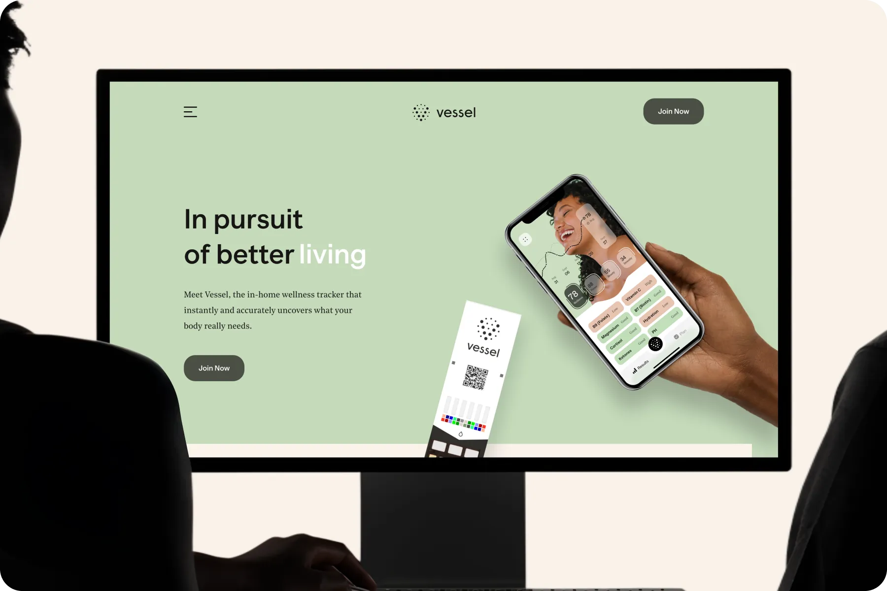
Vessel Wellness - Mobile App example is reflective of the importance of the audience analysis. Vessel’s audience are active on their phones, so designing an app seemed like the best solution. Apart from being easily accessible on the go, we implemented various unique features that enhanced the application and increased the user satisfaction, which is evident in the app rate.
Key Features
4.5/5 rated on market
After designing an app based on the preferences of the audience, Vessel took leadership in the platforms. The first impression and the visual appeal attracted users initially, and the successful UX made them stay. This project is a perfect example of how both the UI and UX contribute to the success of the product.
Product Design Firm | UX & UI Design
Information Architecture UX Design | UX & UI Design
Reviews
Famous people about Vessel
The application has earned the trust of top voices in the health and sports communities.
For example Kelly Slater - the professional famous surfer, has tried using tests and joined the latest fundraising round.
- “
I’m passionate about health and understanding what’s going on in the body. Vessel aligns perfectly with the message I want to put out and what I want to put my energy behind.
Kelly Slater
Professional surfer
Branding
Vessel packaging design
Simplistic packaging that is individually wrapped up.
Inside the box, you will find daily wellness cards or better known as Vessel sticks, that came in simplistic packaging that were individually wrapped up in sleeves with a small box to hold your used test strips along with information to download the Vessel Health application on your phone.
Design A Product | UX & UI Design
Health Wellness design UI/UX ux branding corporate development Web Design SAAS
Result
Final design that drives wellness forward
As a result of our collaboration, we delivered a thoughtful, user-centered design that simplifies the wellness journey. From intuitive navigation and engaging visuals to personalized features, the final product supports users in forming healthy habits while maintaining a clean and modern aesthetic.
- “
The Rondesignlab team successfully completed the project and the app is now available on the App Store.
Jon Carder
CEO of Wellness Tracker
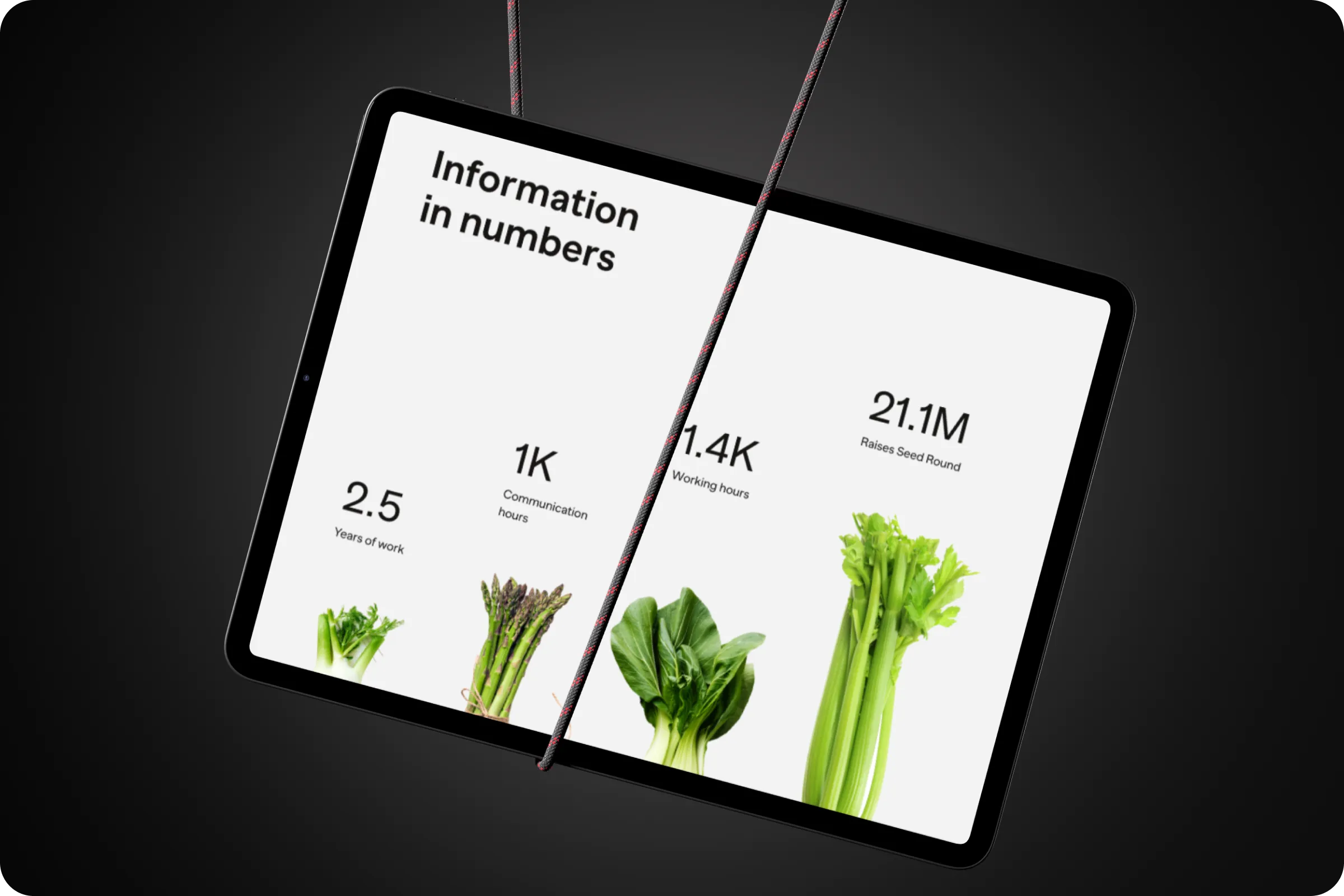
Information in numbers
Vessel Wellness - Mobile App ui / ux design was a long project that took a long time, but also was a massive lesson for us as a team. By the end of it, we had a perfectly designed product that was raising traffic from the very beginning, and we can easily call it a success.
2.5
Years of work
1k
Communication hours
2.1k
Working hours
21.1 m
Raises seed round
Health Wellness design UI/UX ux branding corporate development Web Design SAAS

It was nice seeing you here today. Same place, tomorrow? Or, you fancy another article for the day?
Shall we chat?
[email protected]Let’s

talk
Let’s

talk


