Locate containers, view condition reports, and manage rental...
👀 3144 views
❤️ 345 likes

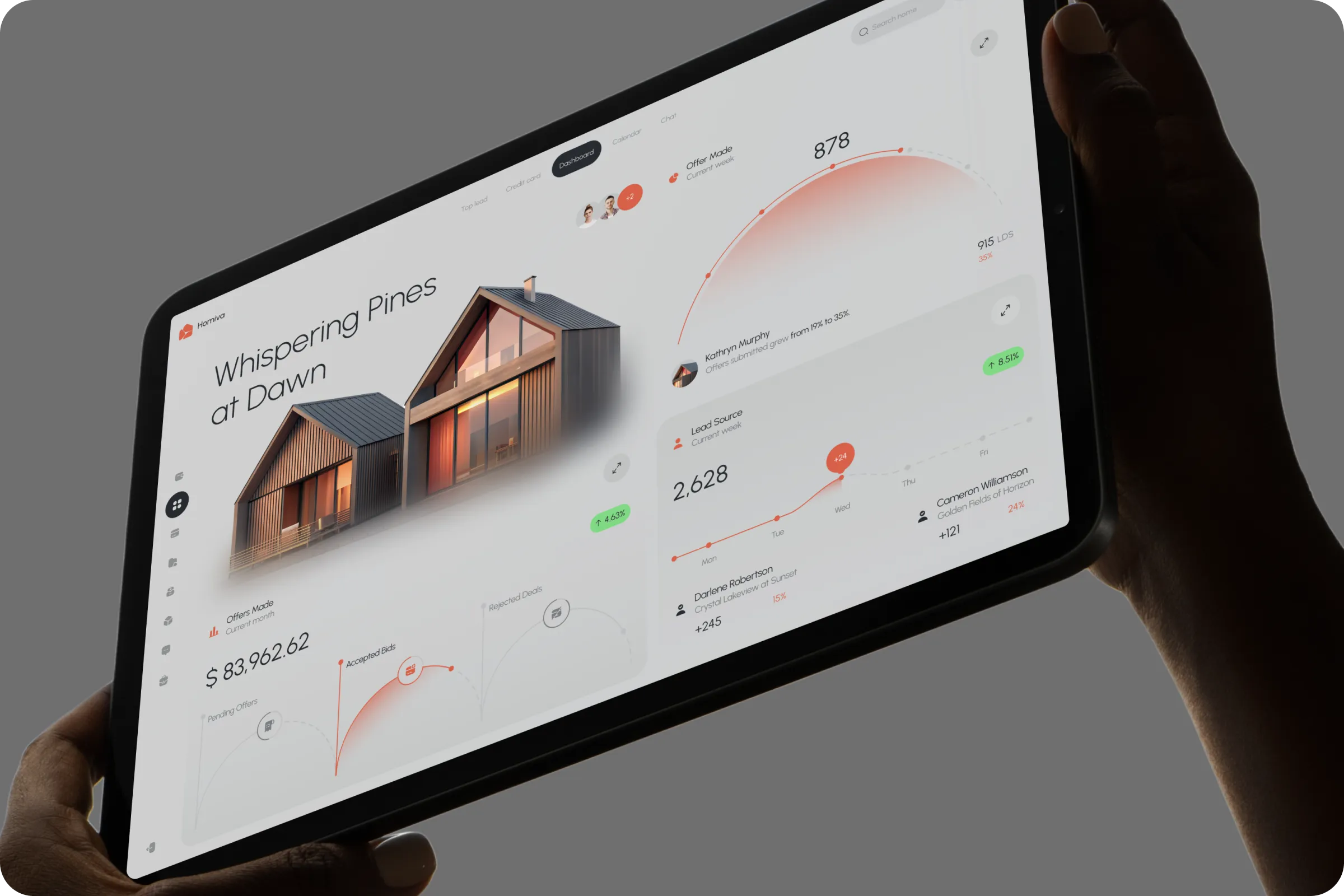
Homiva real estate dashboard UI
We’re building a property search platform where users can instantly understand offer status, pricing trends, and lead sources,without juggling tabs or agents. We want a clear UI that maps data to decisions for faster home-buying

CTO, Homiva

Real estate analytics dashboard design
Homiva is a web-based platform that helps users find properties, track offers, and analyze buyer activity in one unified interface. The goal is to speed up discovery and simplify decisions for homebuyers.
Industry
Real Estate
Category
Platform
Location
New York, USA

Real estate analytics dashboard design
Finding and evaluating real estate options online is often confusing. Users are overwhelmed by scattered listings, poor offer visibility, and unclear agent communication.
Fragmented Property Info
Users switch between apps to track listings, making it hard to compare offers, agents, and pricing clearly.
Low Offer Transparency
Offer status lacks clarity, buyers struggle to understand which deals are active, accepted, or still pending.
Unclear Lead Source Data
No clear insight into which platforms drive leads, making it hard to focus marketing or outreach efforts.

User-friendly real estate platform
In the Homiva - Property Search Real Estate Dashboard project, user interviews and behavior tracking revealed friction in offer clarity, lead funnel understanding, and market evaluation.
61% Of users prefer data dashboards over listings-only views
Users want context around offers, agent actions, and financials, not just images.
47% Failed to understand offer statuses
Unclear visual status or data labels created confusion around accepted or pending offers.
We wanted users to feel like they're navigating a command center, not a confusing feed of listings.

CEO

UI/UX design real estate dashboard
We redesigned the Homiva - Property Search Real Estate Dashboard ui / ux with visual indicators for offers, interactive graphs for lead insights, and centralized bid tracking to help users make informed choices faster.
Dashboard modules (Offers, Leads, Bids) for fast access
Modular layout separates key data types, helping users quickly scan and act without switching dashboard views.
Color-coded offer status arcs
Visual arcs use color and shape to clearly show pending, accepted, or rejected offers at a glance in real time.
Searchable agent and property profiles
Users can instantly search, filter, and compare agent info or property stats without leaving the dashboard view.

Homiva platform design example
The Homiva - Property Search Real Estate Dashboard example improved home search engagement and simplified bid decision-making. It also helped agents better visualize performance data and source leads.
+39% User retention
Improved dashboards and data visuals led to more frequent visits and higher platform engagement.
-22% Decision time
Faster access to offers and property data helped reduce hesitation and increase conversion actions.

Dashboard with home price insights
We're planning mobile extensions next, users want the same experience on their phones while visiting listings or meeting agents.

CTO, Homiva
Shall we chat?
[email protected]Let’s

talk