Finsera AI - Sales CRM Mobile App enables...
👀 3177 views
❤️ 290 likes

Supply Chain Software Dashboard
We need a dashboard that visualizes real-time exceptions across global supply chain nodes, enabling faster decision-making and service recovery with a clear, actionable UI.
Co-founder at Kinaxis ERP

Logistics Optimization Tool Solution
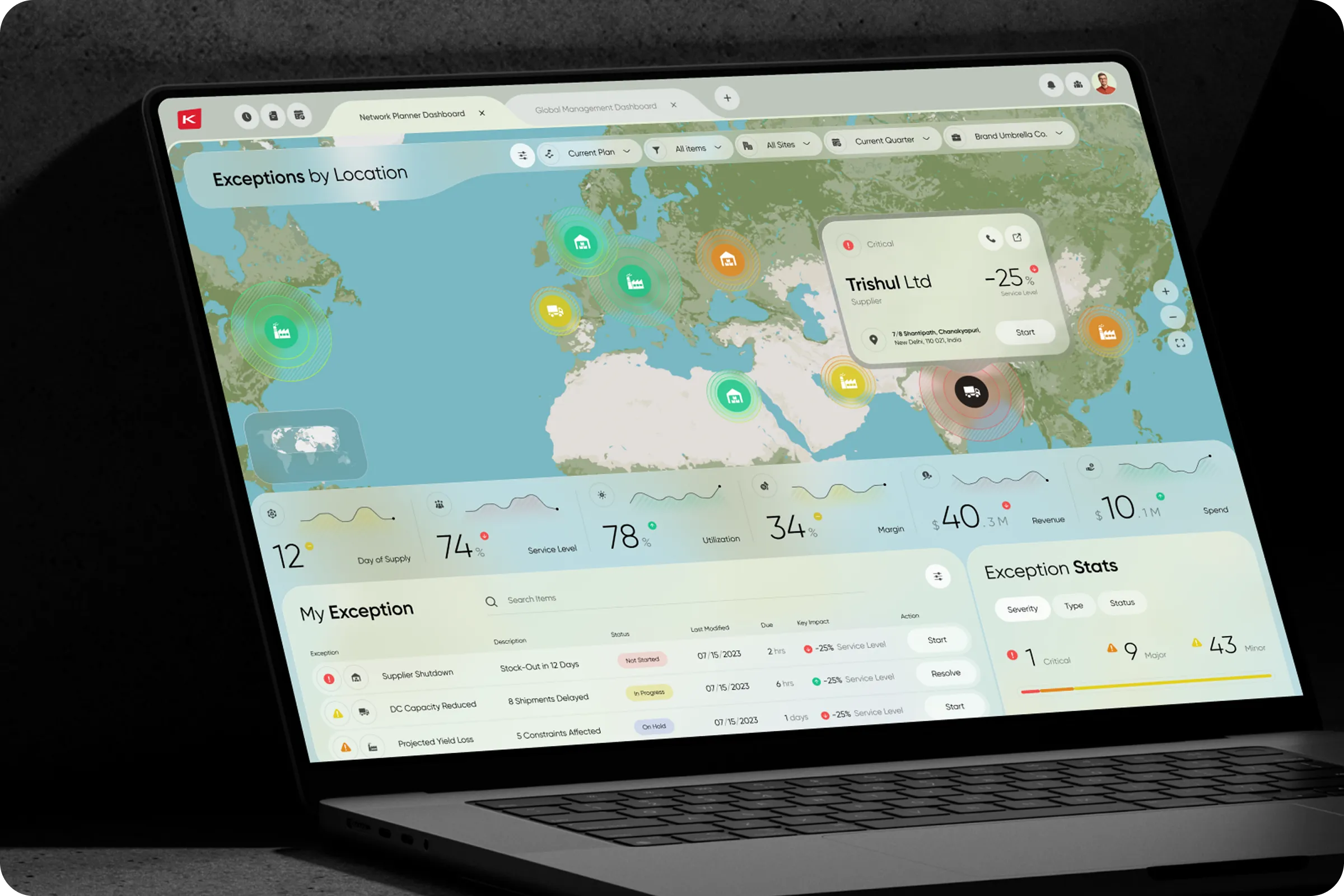
Kinaxis ERP - Network Planner Dashboard is an enterprise UX/UI solution built to help supply chain teams monitor global supplier performance, track exceptions, and manage KPIs from one interface. The system supports real-time visibility and data sync.
Industry
ERP (Enterprise Resource Planning)
Category
SaaS
Location
LA, California, USA

Kinaxis ERP Dashboard UI Design
Stakeholders lacked a unified view of supply disruptions, making it hard to coordinate across suppliers and logistics partners. Users faced difficulty identifying location-specific risks quickly, leading to delayed responses and inefficiencies.
We focused on removing friction and reducing tool-switching for daily operations.

Team Lead

SaaS Product Interface Solution
We conducted structured interviews, surveys, and task-based testing within supply chain departments for Kinaxis ERP - Network Planner Dashboard project. These revealed operational blind spots and usability gaps in current tools.
Research for MyBike - Mobility Bicycle Management Mobile App project showed measurable user needs for real-time tracking, battery status, and distance alerts. Data-focused design decisions improved conversion and retention rates during prototype testing.
Manual Exception Tracking
71% of users tracked exceptions manually or with spreadsheets. This added delays and increased the chance of data errors.
Limited Data Context
Critical metrics like service level, margin, and utilization were not tied to specific locations. This created confusion during analysis and reporting.
Engagement Drops
When exceptions occurred, engagement dropped 23% due to unclear resolution paths and fragmented UI flow.

Custom Logistics Platform Design
We designed a responsive UX/UI dashboard for the Kinaxis ERP - Network Planner Dashboard example. The interface allows users to track exception data by location and act quickly using clear visual signals. Key filters and contextual actions reduce time spent navigating or switching tools.
Location-Based Exception View
We visualized disruptions and delays using a map-first layout. This helped users detect issues by region, improving clarity and reducing decision time.
Filtered KPI Access
Users can now sort data by item, site, or quarter, making it easier to monitor key supply metrics. Each alert includes direct actions to reduce unnecessary steps.
Embedded Alerts and Actions
Critical exceptions are paired with actionable insights within the same screen. This eliminates the need to switch tabs and supports faster issue resolution.

Enterprise Solutions Design
We built a scalable enterprise dashboard from scratch, enabling teams to monitor supply chain health in real time with Kinaxis ERP - Network Planner Dashboard ui / ux. Users can now detect critical exceptions 30% faster and make data-driven decisions with 62% greater location-based clarity.
We delivered a finance dashboard for Zoho Analytics - Finance Management Dashboard ui / ux with 45% faster reporting speed, improved data readability, and increased user retention through ui / ux improvements, directly contributing to better conversion rates and reporting accuracy.
+45% Faster Exception Resolution
The new flow allows users to detect and act on critical supplier issues 45% faster. This directly improved operational stability.
+32% Higher Dashboard Engagement
Clearer visual hierarchy and map-based navigation increased team engagement during daily reviews and crisis events.

Network Planner Software
The collaboration has been great - we’re already exploring ways to enhance real-time data sync and develop versions for mobile and tablet workflows.
Co-founder at Kinaxis ERP
Shall we chat?
[email protected]Let’s

talk