SailMatch - Premium Yacht Booking Service Mobile App...
👀 3047 views
❤️ 336 likes

Finance Dashboard UI Design
We’re looking for a user-friendly finance analytics interface that simplifies complex datasets, delivers real-time insights, and allows users to build custom reports and dashboards with minimal effort.
CPO at Zoho Analytics

Zoho Analytics Dashboard Software
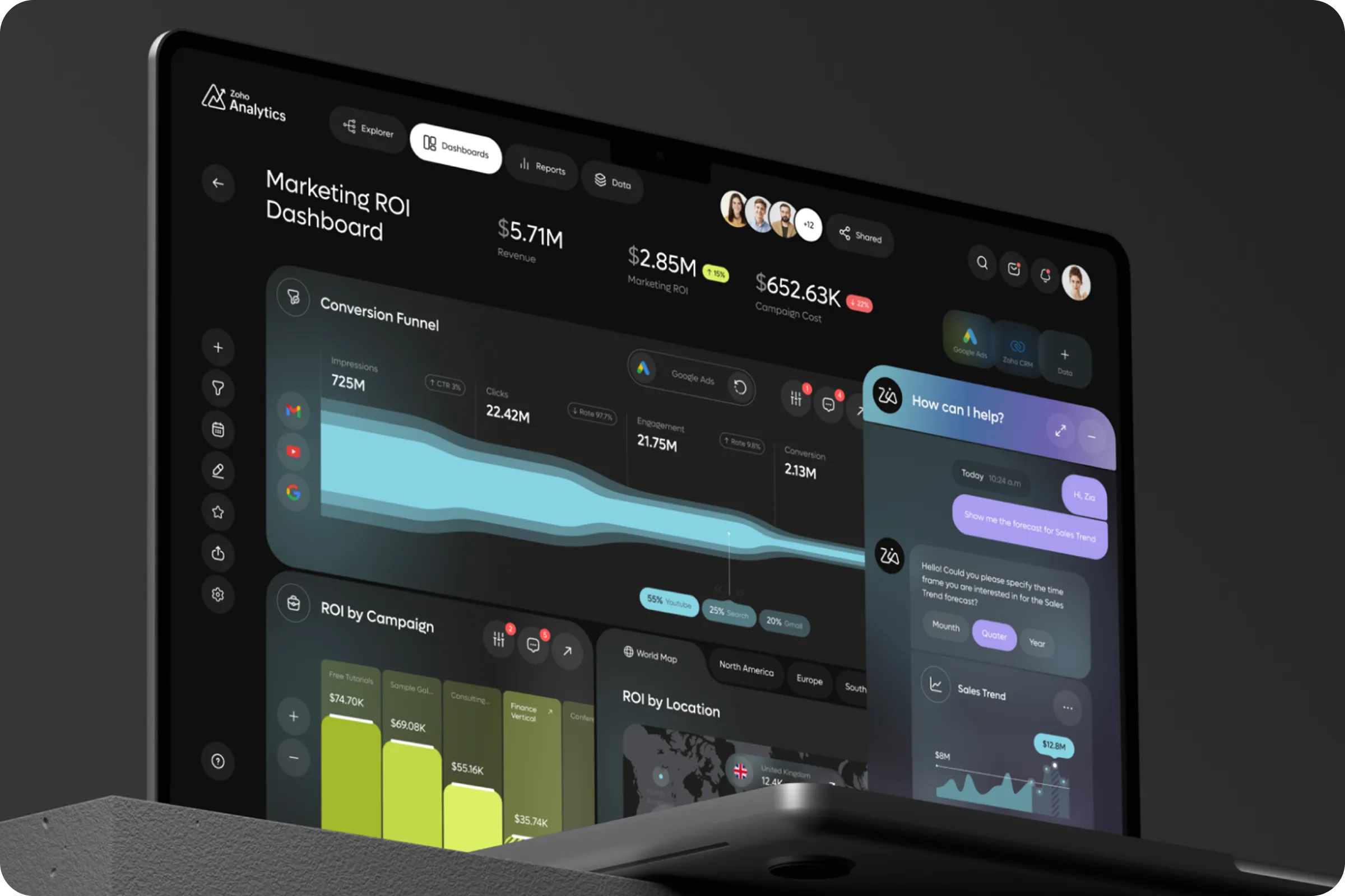
Zoho Analytics is a finance analytics platform designed to streamline financial reporting, visualize multi-source data, and empower users to make informed decisions with customizable dashboards and automated financial insights. The product integrates financial data, improves reporting accuracy, and helps users monitor KPIs through optimized graphic design and ui / ux solutions.
Industry
FinTech
Category
Dashboard
Location
Denver, Colorado, USA

Financial Data Visualization UI Design
Finance teams faced low reporting efficiency and limited visibility into financial performance. The existing Zoho Analytics - Finance Management Dashboard project lacked a structured ui / ux approach, making routine tasks harder for end users.
Data Complexity
Users struggled to process multiple financial data streams. The interface made it difficult to track key metrics, which negatively impacted engagement and slowed reporting speed.
Inefficient Reporting
Manual reporting processes reduced team efficiency. Users reported delays in creating reports, which increased workload and reduced satisfaction across finance departments.

Financial Data Analytics Software Development
For Zoho Analytics - Finance Management Dashboard example, research revealed key behavioral trends that affected user engagement and retention. We focused on improving reporting speed and visualization clarity through data-driven design decisions.
Research for MyBike - Mobility Bicycle Management Mobile App project showed measurable user needs for real-time tracking, battery status, and distance alerts. Data-focused design decisions improved conversion and retention rates during prototype testing.
+52% - Faster Report Generation
User interviews showed a 52% time reduction in creating standard financial reports after simplifying reporting modules and reducing steps in data handling.
+36% - Engagement Rate Growth
Optimized ui / ux resulted in a 36% increase in active dashboard usage, reducing user drop-offs during reporting tasks and improving session length.
+28% - Higher User Satisfaction
Satisfaction surveys showed a 28% increase after dashboard restructuring, especially in the areas of customization options and reduced manual work.

KPI Tracking UX Design
For Zoho, we created a clean ui / ux design focused on simplifying financial reporting. We consolidated data panels to reduce navigation time and improved visual hierarchy for faster access to key metrics. Custom widget options helped users track important data points with fewer clicks.
Simplified Dashboard Structure
We reduced data clutter by merging key panels into a unified dashboard. This improved navigation speed and allowed finance teams to monitor essential metrics in a single view.
Custom Widgets for Flexibility
We added customizable widget options to adjust financial dashboards based on individual user needs. This reduced time spent on manual adjustments and improved user engagement.
Improving data visibility and user control was key to enhancing the overall finance dashboard experience.

Team Lead

Custom Finance Management Service
We delivered a finance dashboard for Zoho Analytics - Finance Management Dashboard ui / ux with 45% faster reporting speed, improved data readability, and increased user retention through ui / ux improvements, directly contributing to better conversion rates and reporting accuracy.
+31% in daily active users
Improved navigation and simplified interfaces contributed to a 31% increase in daily active users and reduced churn rate across finance teams.
+25% Higher Retention Rate
Simplified navigation and consistent layout improved daily usage. Users returned more frequently, increasing overall product stickiness and long-term adoption.

Zoho Analytics SaaS Solution
We’re planning to extend this design system into mobile platforms to ensure consistent financial analytics experiences across devices, helping users stay informed and proactive wherever they work.
CPO at Zoho Analytics
Shall we chat?
[email protected]Let’s

talk