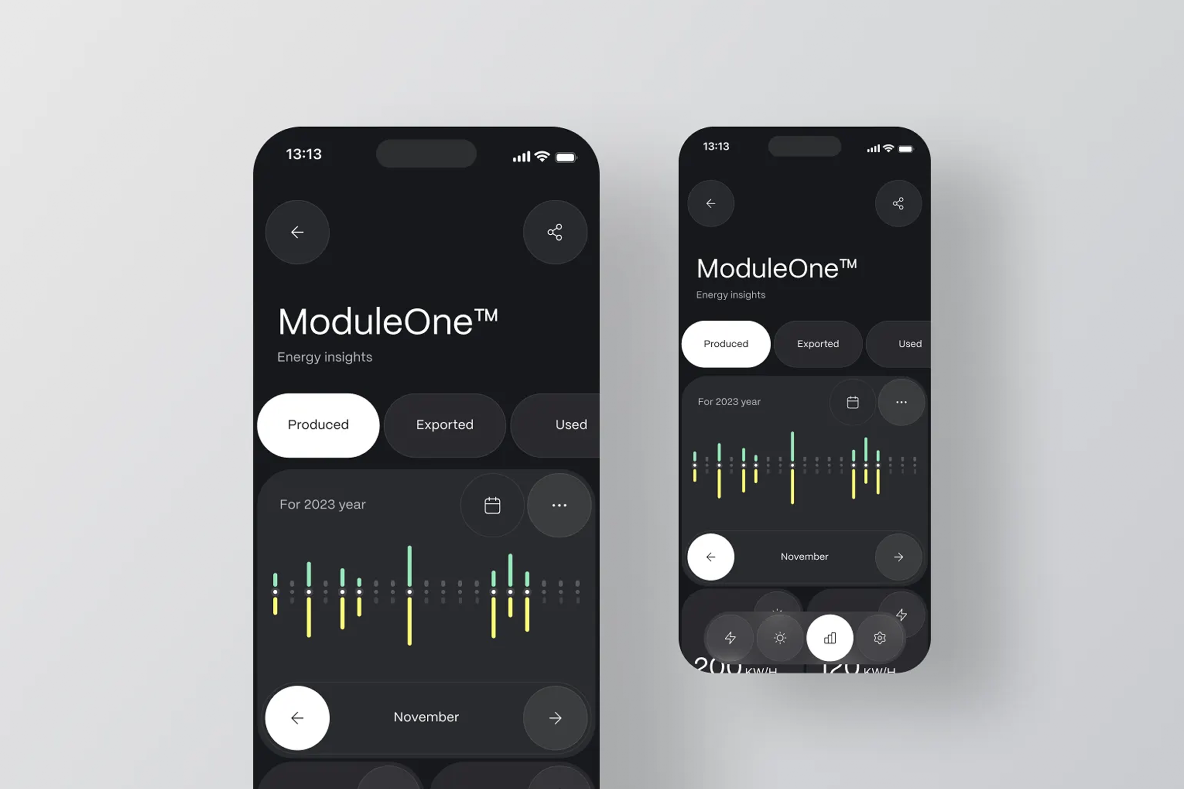
Avoid common SMM design mistakes with our expert...
👀 2313 views
❤️ 175 likes

Mobile-first UX
Mobile-first UX Design
Most people today use their phones to go online, so designing websites and apps for mobile devices first is super important.
This approach, called mobile-first UX design, means starting with the smallest screen and then expanding to bigger ones. It helps ensure your digital products are easy to use, fast and enjoyable for everyone, no matter what device they're on. Focusing on mobile optimization from the start leads to a better overall user experience.

Mobile-first UX
Mobile-first UX is a design strategy that prioritizes the mobile experience from the very beginning of a project.

COO
Instead of designing for desktops and then scaling down, you design for the smallest screen first, focusing on core functionality and essential content. By embracing user-centricity, mobile-first design offers significant benefits.
It directly tackles pain points like cluttered interfaces, slow loading times and difficult navigation commonly found on sites not optimized for mobile. By implementing these solutions, small business owners, product managers and marketing professionals can significantly enhance their digital product performance.

Mobile-first UX
Responsive Layouts
Design layouts that smoothly adjust to different screen sizes. This ensures content always looks good and is easy to read, preventing users from having to zoom or scroll horizontally. This is crucial for seamless web design.
Touch Target Sizing
Make buttons and links large enough to be easily tapped with a finger (generally 48x48 pixels). This prevents frustrating mis-taps and improves usability for all users, enhancing user satisfaction.
Simplified Navigation
Keep menus and navigation paths clear and concise. Mobile screens have less space, so prioritize essential links and use common patterns like hamburger menus wisely. This reduces cognitive load and improves the user journey.
Fast Load Times
Optimize images, code and content to load quickly. Mobile users often have slower connections and every second counts. Faster loading directly impacts user retention and conversion rates.
Clear CTAs (Calls to Action)
Make your primary actions stand out and be easy to find. Whether it's "Buy Now" or "Contact Us," a clear and prominent CTA guides users toward desired actions, boosting conversion.
These tips help create a more efficient and enjoyable experience, vital for maximizing mobile optimization efforts.

CX Designer

Mobile-first UX
Many successful companies showcase excellent mobile-first UX by prioritizing the user experience on smaller screens.

CIO
Take Instagram, for instance. It was initially designed as a mobile-only app and its core functionality (like photo sharing and viewing) is perfectly optimized for smartphones. Its large, scrollable image feed, intuitive gesture-based navigation and prominent "like" and "comment" buttons are direct results of a mobile-first approach.
This focus led to incredibly high user engagement and retention, contributing to its massive global user base (over 2 billion monthly active users as of 2024).
Another great example is Netflix. While they have a strong desktop presence, their mobile app design is a masterclass in mobile optimization.
Features like clear content categories, large video thumbnails and a simple tap-to-play function make browsing and watching effortless on a phone. The ability to download content for offline viewing, a feature highly relevant to mobile users on the go, significantly boosts user satisfaction.

Mobile-first UX
Netflix's smooth mobile UX is a key factor in its high subscription conversion rates and consistent user retention, as users find it incredibly convenient to access entertainment anytime, anywhere.
Their app's performance metrics, including low latency and quick content loading, are meticulously optimized for the mobile environment, directly contributing to their leading position in the streaming market and driving overall traffic.
These examples demonstrate how prioritizing mobile user needs leads to highly successful and sticky digital products.

Team Lead
At RDL, we are dedicated to helping businesses thrive in a mobile-first world. We understand that small business owners, product managers and marketing professionals need practical solutions for their digital products.
We provide expert guidance and implementation for mobile-first UX design, ensuring your online presence is powerful and effective on any device.
Our services include smart design adaptation to guarantee seamless transitions from mobile to larger screens without compromising clarity or functionality.

Mobile-first UX
We help optimize layouts, simplify navigation and fine-tune elements for touch interaction, all while prioritizing fast load times and clear calls to action.

UX/UI Designer
We are committed to boosting your user satisfaction, improving user retention and ultimately increasing your conversion rates through intelligent mobile optimization strategies.

UX Architect

Mobile-first UX
Mastering mobile-first UX design is fundamental for any product aiming for broad reach and sustained engagement.

UX Architect
By intentionally crafting experiences that prioritize the opportunities of smaller screens, products become inherently more accessible, delightful and efficient for the vast majority of users.
This strategic foresight in mobile optimization doesn't just improve current interactions; it lays a foundation for future growth, building user trust and driving substantial value in an increasingly mobile-centric world.
Shall we chat?
[email protected]Let’s

talk