Locate containers, view condition reports, and manage rental...
👀 3144 views
❤️ 345 likes

Farm Management SaaS Dashboard example
We manage hundreds of hectares and need a unified dashboard to monitor crop health, schedule tasks, and respond to changing field conditions. It should visualize real-time data and support decisions for sustainable yield optimization.

CEO, AgroFlow

AgroFlow farm management dashboard UI
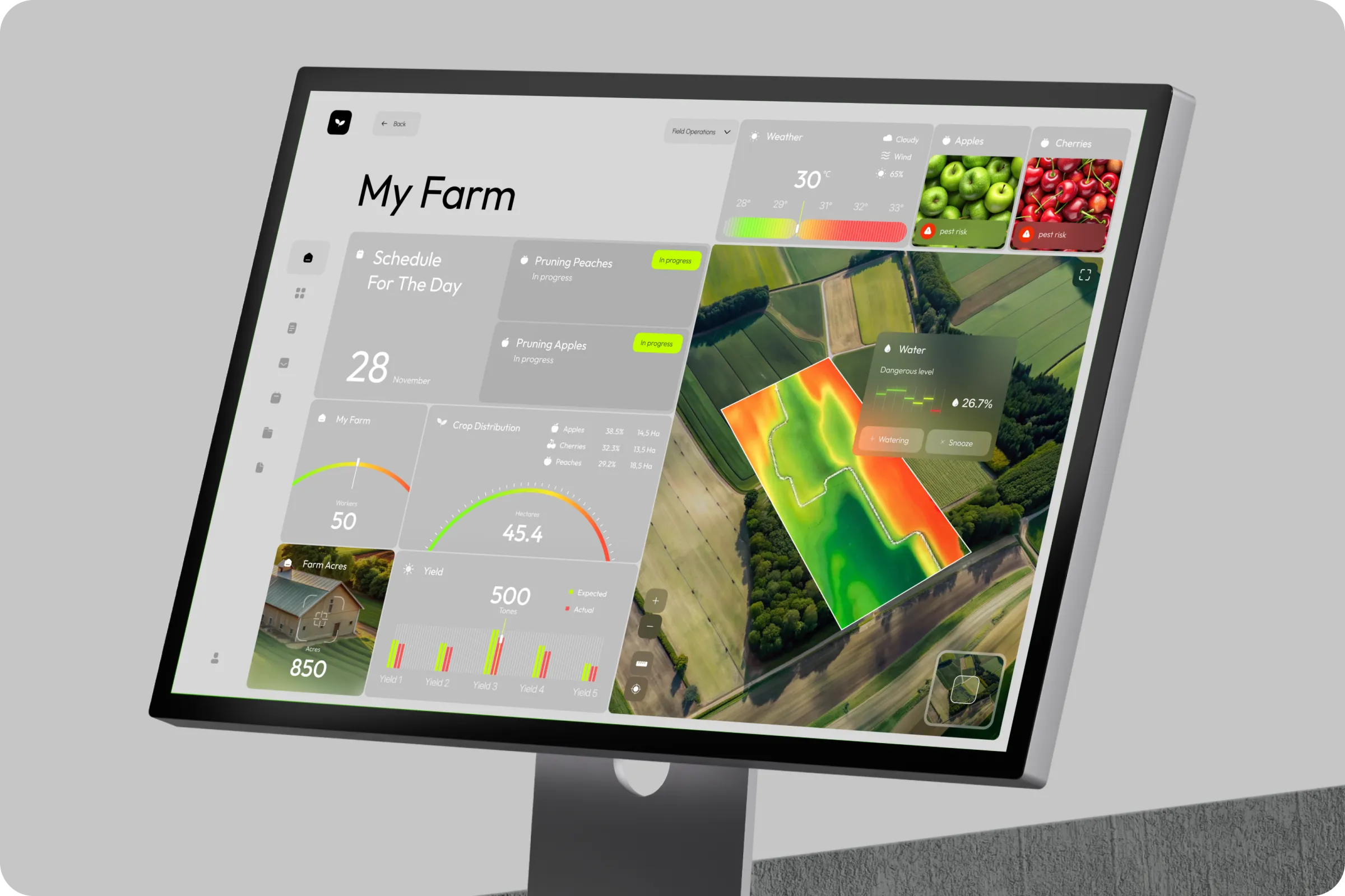
AgroFlow helps agricultural teams plan daily operations, track crop status, and improve yield visibility. This AgroFlow - Farm Management SaaS Dashboard ui / ux centralizes decision-making to reduce resource waste and increase productivity.
Industry
AgriTech
Category
SaaS
Location
New York, USA

SaaS agriculture monitoring interface
Farm managers faced fragmented data sources and poor visibility into field operations. Teams struggled to coordinate irrigation, crop care, and workforce across large-scale acres.
Scattered Data Inputs
Different tools for weather, scheduling, and yield made it hard to gain actionable insights in one place.
Low Resource Efficiency
Inability to predict issues like under-watering or pest risk led to overuse of labor and poor crop performance.

Smart farming UX design
To build AgroFlow - Farm Management SaaS Dashboard example, we started with interviews across farm teams to map workflows. Our design team created a modular dashboard UI with spatial data layers, crop segmentation, and live scheduling to support agile decision-making.

Crop yield tracking dashboard
AgridFlow focused on transforming a fragmented farming management tool into a unified, data-driven SaaS platform. Our team designed user-centric interface that simplifies daily operations, streamlines resource planning. To achieve consistency across the system, we introduced an adaptive set of metrics and real-time indicators, ensuring farmers always have accurate insights into crop health, irrigation needs, and equipment performance.
Industry
Project type
Result
Our goal was to visualize field conditions, simplify yield management, and integrate planning into one clear dashboard. The dashboard UI/UX focused on water levels, pest risk alerts, and real-time progress updates to streamline day-to-day decisions.
Visual Alerts & Risk Mapping
Color-coded overlays help identify high-risk crop zones and water-stressed areas instantly.
Operational Clarity
Interactive task cards simplify daily planning and boost transparency across farm activities.
Crop Distribution Intelligence
Visual breakdown of crop types per hectare supports smarter planning and yield comparison.

Real-time irrigation control UI
We conducted on-site usability testing and interviewed field teams to identify gaps in task planning, water use, and crop visibility. Feedback revealed critical needs around real-time updates and visual decision-making tools.
63% Needed weather-linked irrigation tracking
Users prioritized syncing irrigation plans with local weather to reduce overuse and avoid drought stress.
58% Wanted visual crop distribution
Crop-specific hectare views helped teams allocate resources and compare seasonal yield trends.

Weather-based farming dashboard
We created a smart dashboard UI that merges aerial field maps with crop segmentation, real-time weather, and a predictive water risk layer. The design includes quick task status cards and intuitive visual metrics to reduce response time and manual input.

AgroFlow field map visualization
Smart Watering Control
Integrates zone-based moisture levels with auto-alerts for under-irrigation.
Pest Risk Detection UI
Fruit-specific alerts with image cues reduce guesswork in crop protection planning.

Precision agriculture UX design
The AgroFlow - Farm Management SaaS Dashboard project led to improved crop visibility, streamlined team coordination, and more efficient daily task execution through centralized real-time data.

Agricultural SaaS user interface
+44% Task clarity
Clear schedules and progress states made pruning and daily planning more efficient. (110 characters)
-27% Resource waste
Smart alerts helped reduce unnecessary water usage and better allocate seasonal labor. (110 characters)

Farm scheduling and task planner UI
We’re already planning an adaptive version of AgroFlow for mobile use in-field and want to expand it with drone data. The team understood our workflow and built a tool that supports real decisions, not just reporting.

CEO, AgroFlow

Crop distribution data dashboard
Shall we chat?
[email protected]Let’s

talk