Explore elegant accessories with Moda. Improve product discovery...
👀 3064 views
❤️ 307 likes

AI Monitoring Dashboard UI Design
We need a dashboard that simplifies monitoring tools and offers real time data visualizations that define pain points.
Co-founder at AppDynamics

App Performance Tracker Dashboard
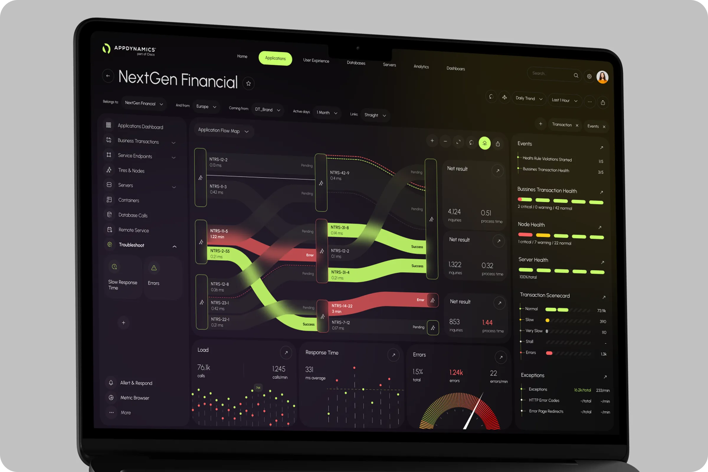
AppDynamics - App Performance Monitoring Dashboard project is a UX/UI solution for tracking app and infrastructure performance. It helps reduce response time and improves how technical teams access critical system data. Our goal was to translate its complex tech into a clear, user-friendly experience.
Industry
APM (Application Performance Monitoring)
Category
SaaS
Location
Washington, D.C., USA

SaaS Software Development
Users struggled with a monitoring experience that was fragmented and hard to interpret in the moments that mattered most. Key metrics were spread across many views and tools. People had to switch dashboards to see what was happening.
Many visual patterns felt old and inconsistent. This made it harder to scan fast, compare trends, or spot anomalies with confidence.
Dashboards were also rigid and slow to adapt. They didn’t show real-time user behavior or changing system conditions. So teams couldn’t easily adjust what they saw as the incident evolved.
As a result, investigating an issue meant manually stitching together logs, alerts, traces, and performance metrics. These were often in separate places, with different filters, timestamps, and context. This disconnected workflow increased mental effort.

Saas Dashboard UI Design
For AppDynamics, we mapped the complete end-to-end user journey. Through user research and stakeholder workshops, we identified key personas. We documented their goals, pain points, and decision-making moments.
We then aligned the dashboard’s structure and navigation to key workflows. These include monitoring overall health and drilling into services and transactions. They also include linking performance to infrastructure signals and doing root-cause analysis.
We designed the experience to make performance data easy to see, understand, and act on. Key metrics were prioritized with a clear visual hierarchy, consistent patterns, and contextual explanations. Users could quickly see what was normal versus abnormal.
Interactive filters, comparison views, and guided drill-down paths helped users move from high-level trends to detailed diagnostics. They did this without losing context. We also incorporated actionable cues so teams could identify issues faster, collaborate more effectively, and take confident action to restore and optimize application performance.
Our aim was to support user goals, not just present data.

Team Lead

Infrastructure Monitoring Software Solution
We aimed to build a flexible web UI for AppDynamics visual representation. It tracks app behavior live, reduces fatigue and enables faster discovery through a more connected performance management experiencWe aimed to build a flexible web UI for AppDynamics visual representation. It tracks app behavior live, reduces fatigue and enables faster discovery through a more connected performance management experience.

AppDynamics Dashboard Interface Concept
We conducted sessions with product managers, QA engineers, and developers to understand usage gaps. Real-time responsiveness and AI-supported event clustering were top priorities.
We used internal product audits, user session reviews, and data from CRM analytics reports to uncover key blockers. Focus remained on how UX UI decisions impact conversion rate, user retention, and engagement scores.
67% used non-AI flows
Users didn’t trust the existing AI logic. By adding clear visual explanations, adoption rose during testing by 32%.
41% delay in alerts
Notification logic didn’t match issue severity. This delay impacted response time and support metrics.
52% ignored historical data
Users preferred real-time metrics but missed patterns that caused repeated issues. We introduced compact trend visuals to improve awareness without overwhelming the layout.

System Health Monitoring Development
We implemented a flexible component grid, unified alert states, and layered service maps. The interface of AppDynamics - App Performance Monitoring Dashboard example now adapts based on user roles. The final design upkeeps visual consistency that matches the AppDynamics logo and business objectivesWe implemented a flexible component grid, unified alert states, and layered service maps. The interface of AppDynamics - App Performance Monitoring Dashboard example now adapts based on user roles. The final design upkeeps visual consistency that matches the AppDynamics logo and business objectives.
Role-Based Interface Logic
We designed the layout to respond to specific user needs - engineers, analysts, or leadership. Each role sees tailored views without extra navigation.
Unified Alert Structure
We introduced a single visual system for alerts across metrics and services. This helped users prioritize actions faster and reduced confusion from duplicate notifications.

AI-Powered Metrics Design
The AppDynamics - App Performance Monitoring Dashboard ui / ux increased alert response speed and reduced user drop-off. Engineers accessed key metrics 2.4x faster. Session duration rose by 39%, and dashboard interaction improved across all user roles.
+36% Faster Incident Resolution
Clear alert structure and improved data layout helped reduce mean time to resolution by 36%. Support teams handled issues with fewer steps and higher accuracy.

Performance Analytics UI Design
Shall we chat?
[email protected]Let’s

talk