Avoid ruining UX with poorly integrated ads. Discover...
👀 2415 views
❤️ 321 likes

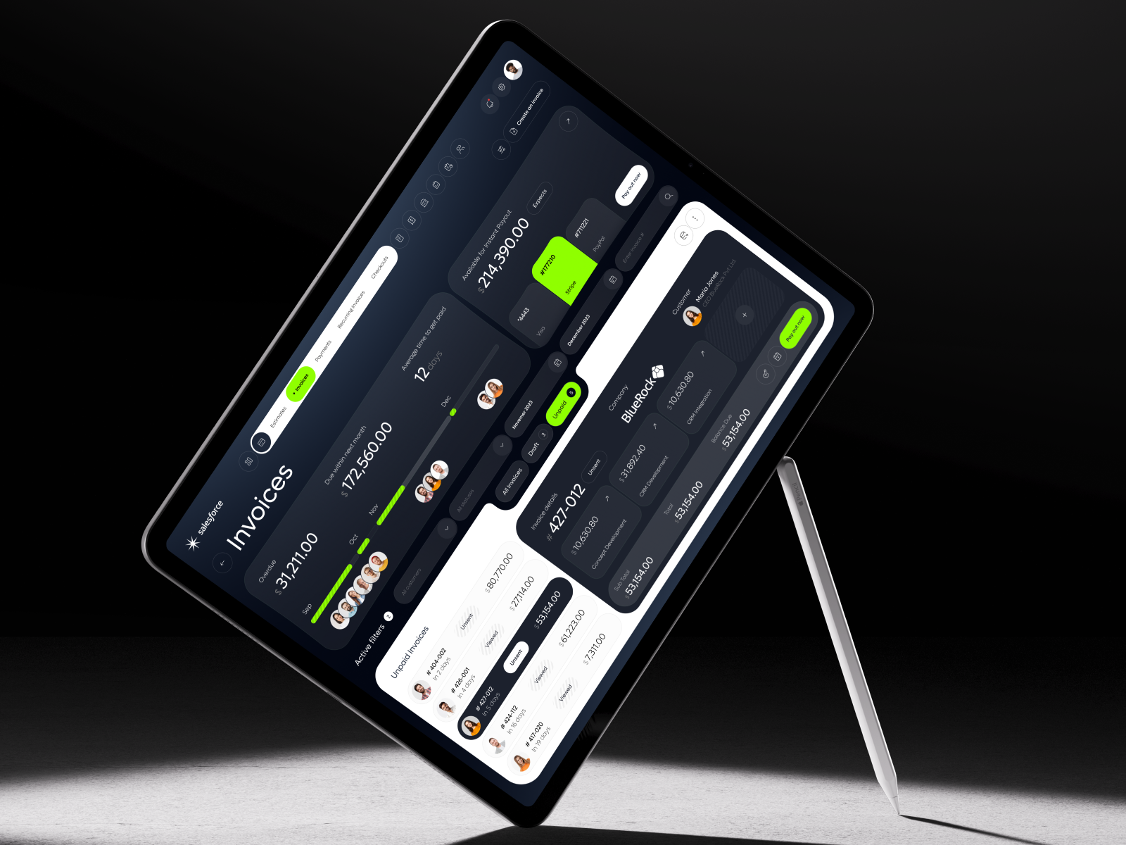
Salesforce - Invoice CRM Dashboard
In our increasingly digital world, people spend hours every day looking at screens. While technology connects us, this constant screen time can lead to issues like eye strain and mental fatigue.

UX Architect
This is where digital wellness in UI/UX design becomes crucial. By focusing on user comfort and reducing screen fatigue, designers can create experiences that are not only effective but also healthier.

CX Designer

DroneOps - Mission Control Dashboard
UI/UX Effect on Screen Fatigue and User Comfort
Thoughtful UI/UX design plays a direct role in enhancing user comfort and decreasing screen fatigue. When a digital product is designed with user well-being in mind, it impacts several key metrics.
Elements like appropriate color contrast, readable typography and mindful animation reduce eye strain and cognitive load. For instance, using sufficient contrast (e.g., meeting WCAG 2.1 AA standards for contrast ratios) can improve readability by 50%, making text easier to consume and reducing visual fatigue.
The presence of features like "dark mode" or customizable text sizes directly contributes to user satisfaction by giving users control over their viewing experience.
Products offering these options often see higher user engagement metrics, such as longer session durations (e.g., users might stay 15% longer if they can switch to dark mode in low light).
This is because users feel more comfortable and less prone to discomfort during extended use.

UX/UI Designer

Lomispay - Payment Mobile App
Moreover, reducing screen fatigue can lead to higher conversion rates. If a user experiences discomfort, they are more likely to abandon a task or leave a site.
By contrast, a comfortable user is more likely to complete a purchase, fill out a form, or subscribe.
While difficult to measure directly, an improved sense of user well-being contributes to better user retention and positive word-of-mouth, indirectly boosting overall traffic quality and reducing bounce rates. Investing in these subtle comfort elements is a strategic move for any digital product.
Many popular digital products are actively implementing UI/UX solutions to enhance user comfort and combat screen fatigue.
A clear example is the widespread adoption of "Dark Mode" across operating systems and applications. Platforms like Twitter (now X), YouTube and iOS/Android offer dark themes that reduce the amount of bright light emitted, making them more comfortable to use in low-light environments and reducing eye strain.

Splunk - Data Analytics Dashboard
Studies indicate that dark mode can reduce power consumption on OLED screens by up to 60% and evidence suggests a significant improvement in perceived user comfort during nighttime use. This feature directly leads to increased user engagement during evening hours and higher user satisfaction for users sensitive to bright interfaces.
Another solution focuses on typography and spacing. Reading apps like Kindle or article platforms like Medium prioritize legibility. They use carefully chosen fonts, optimal line spacing and adequate letter spacing to create a comfortable reading experience.
For instance, Medium's consistent use of a clean, sans-serif font (like Charter or Lyon Text) with generous line height and paragraph spacing minimizes visual clutter, allowing users to read long articles without significant eye fatigue.

SolarEdge - Solar Panel Dashboard
This focus on typographical user comfort directly impacts user engagement (measured by longer time on page or completed reads) and user retention, as users find these platforms less taxing on their eyes compared to others.

Team Lead
These examples highlight how subtle UI/UX design choices contribute significantly to digital wellness and a better overall user experience.

COO
At RDL, we believe that thoughtful UI/UX design is key to reducing screen fatigue and enhancing overall user comfort. Our approach goes beyond mere aesthetics, focusing on creating interfaces that are not only intuitive but also gentle on the eyes and mind.
We integrate digital wellness principles into every stage of our design process.

UX Architect

Solithic - Renewable Energy SaaS
This includes selecting optimal color palettes and contrasts to minimize eye strain, choosing legible typography with appropriate line spacing and implementing features like dark modes or customizable display settings where suitable.
We also pay close attention to animations and transitions, ensuring they are smooth and purposeful rather than distracting. Our solutions aim to reduce cognitive load and visual clutter, allowing users to engage with digital products more comfortably for longer periods.
By focusing on these elements of user comfort, we help our clients have greater user satisfaction and we build digital products that truly support user well-being and encourage sustained user engagement.

Homiva - Real Estate Web Dashboard
The shift towards digital wellness in UI/UX design is a crucial evolution, acknowledging the human impact of extended screen time. By strategically implementing elements that reduce screen fatigue and enhance user comfort, designers can create more humane and sustainable digital experiences.
This proactive approach not only benefits users by promoting their well-being but also benefits businesses through increased user satisfaction, higher engagement and improved retention.
Prioritize designing for human comfort - it’s the future of truly impactful digital products.
Shall we chat?
[email protected]Let’s

talk