


66% of insurance claims are overpaid on late...
👀 1563 views
❤️ 340 likes
Too Long;
Didn't Read
37% higher daily engagement, 27% deeper health awareness, 18% clearer biometric data. See how Veri rebuilt health tracking into a daily habit:
About the project
Veri is an advanced health score dashboard that simplifies capturing, monitoring, and understanding complex daily biometrics with real-time data visualization.
Most health apps make the same mistake. They collect data without giving users a way to act on it. A glucose reading arrives, a sleep score appears, a step count increments, and none of it connects into anything a person can actually use to change their day. Veri was built against that pattern from the ground up, treating the interface not as a data display but as a decision surface. Every screen was designed to answer the question a user brings to it in the first three seconds, then get out of the way so the next decision can happen.
The product sits at a specific intersection that health technology has rarely served well. Biometric monitoring has historically belonged to clinical settings and endurance athletes, the people with both the motivation and the training to interpret raw numbers. Veri's founding premise was that continuous glucose monitoring, metabolic tracking, and daily variability data belong in the hands of anyone who eats, sleeps, and moves, which is everyone. That premise required an interface capable of making complex biology feel like obvious information rather than a diagnostic readout. Building that interface is what this case documents.
Project
Health Tracking App
Location
Tracking App
Industries
Year
2026
The scope covered the full product ecosystem: a mobile app that serves as the primary daily surface, a landing page built to convey the product's depth to a skeptical wellness audience, a social media system that extends the brand beyond the screen, and a visual identity that holds all of it together without ever letting the brand compete with the data it exists to surface. Helvetica Neue, a deep black foundation, green life accents, and a modular card architecture were each chosen because they serve the digital health tracking mission, not because they trend in healthcare design.
The larger goal was to prove that a daily health tracking app can earn a permanent place in a user's morning routine, the same way a coffee or a workout does, because it gives them something genuinely useful within the first thirty seconds of opening it. The 37% daily engagement lift and 27% deeper health awareness the redesign produced confirm that the interface earned that place rather than demanding it.

Logo Design
The Veri logo represents precision, clarity, and biological harmony as the core values of the brand. Built from clean typographic forms, it reflects internal balance within the modern digital health ecosystem.
The wordmark emphasizes simplicity and vital rhythm, reinforcing Veri’s true role as an operating system. A precise typographic grid ensures consistency, readability, and clarity across all digital and physical healthcare interfaces.


Typography
Helvetica Neue was chosen as the primary typeface to reflect Veri’s modern, health-driven identity. Its clean geometry and open letterforms ensure excellent readability across dashboards, navigation, and biometric displays.
The typeface balances technical precision with approachability, making complex health metrics feel clear and accessible at a glance. With a flexible range of weights, Helvetica supports strong visual hierarchy while maintaining consistency across the entire interface — from bold headings to dense informational content.

Colors
The color palette was designed to reflect wellness, balance, and physical vitality. A deep black foundation creates a focused, immersive interface, allowing essential health metrics to stand out without distraction.
Subtle green accents introduce a sense of life, harmony, and internal rhythm, reinforcing Veri’s purpose and real-time responsiveness. Crisp whites and silvers balance the system, ensuring clarity, contrast, and legibility across dashboards, graphs, and health analytics.

Social Media
Veri’s social media presence extends the brand experience beyond the app and the tracker itself. Each visual is crafted to communicate balance, vitality, and wellness at a glance — combining bold composition, deep contrast, and clear messaging to make the system instantly recognizable and shareable.
We treated social media as an extension of the interface — every post needed to feel as intentional, insightful, and balanced as the dashboard itself.

UX Architect

Mobile app
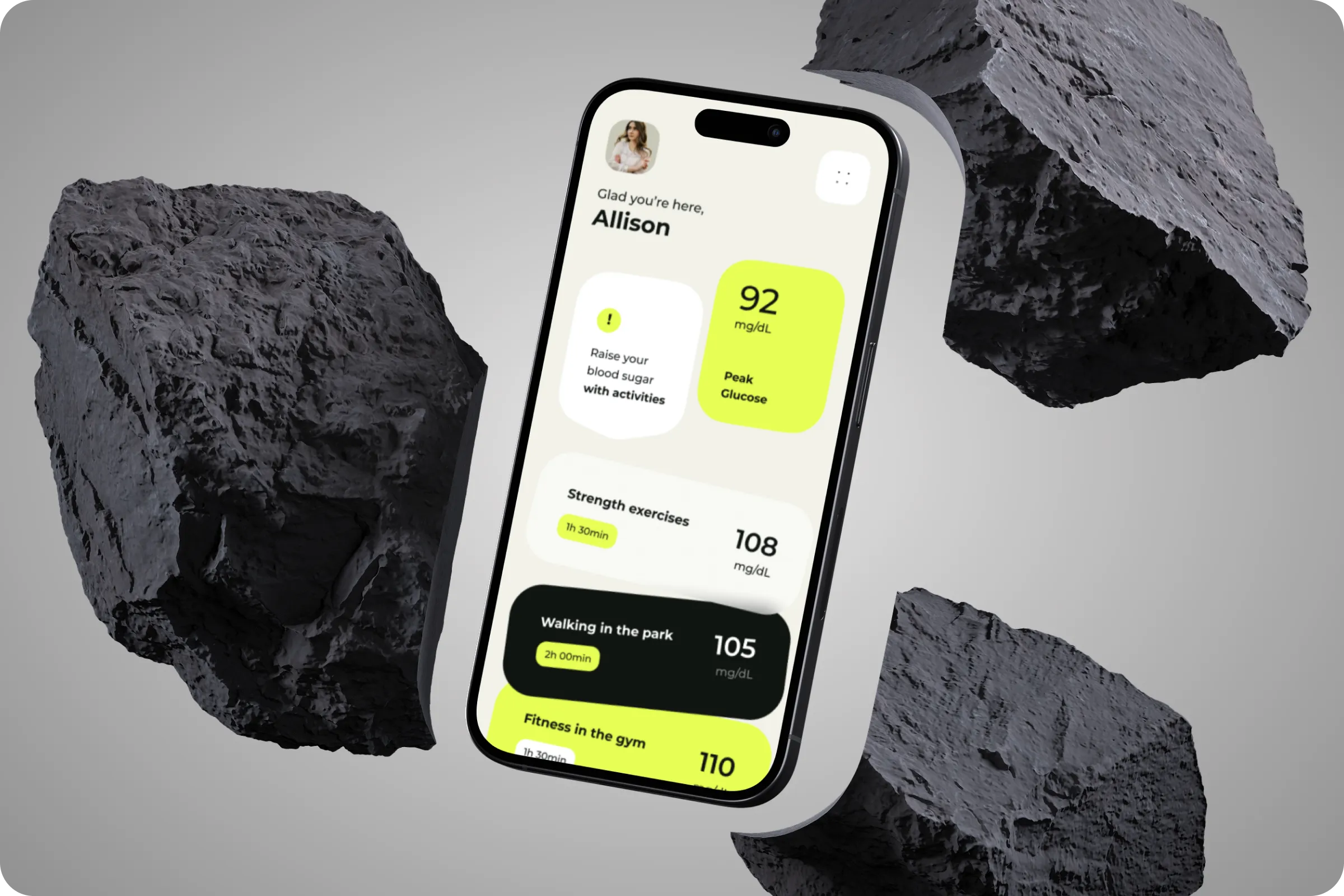
A mobile version of Veri makes it perfectly easy to stay connected to your daily health data, wherever you are. Information is organized into modular cards, showing essential metrics such as real-time glucose, daily variability, metabolism, and precise sleep stages.
Deep contrast, precise typography, and intuitive iconography reduce cognitive load, helping users interpret biometrics quickly. Visualizing data through fluid graphs and subtle indicators creates clarity and encourages balance.
Glucose Levels
Real-time glucose concentration is displayed with visual indicators for optimal ranges. This helps users monitor energy stability and detect metabolic spikes with minimal effort.
Daily Variability
Internal rhythms are tracked throughout the day using average values and stability markers. Trends are shown in real time, enabling users to compare daily performance and balance.
Metabolic Health
Data is broken into active, resting, recovery, and peak phases along a daily timeline. Clear visualization makes complex biology easy to follow and supports user awareness of metabolic patterns.

Landing Page
The landing page introduces the Veri digital health ecosystem as a premium, intelligent wellness platform from the very first interaction. Large-scale typography, restrained layouts, and interface-first visuals establish clarity, confidence, and focus — allowing users to immediately understand what the Veri product is and why it matters.
The experience prioritizes storytelling through structure, guiding attention from brand identity to health value without distraction.
Data-Driven Narrative
The layout leads with the dashboard itself, ensuring that visuals and messaging work together to communicate value before features.
Clear Visual Hierarchy
Precise typography and balanced spacing create clear entry points and effortless scanning.
Seamless Brand Integration
Color, type, and motion align with the broader Veri ecosystem, reinforcing consistency across web, app, and social media.
Designed for Scalability
The structure supports future expansion — from new biometric tracking to advanced AI features — without compromising clarity.

Branding
Veri’s branding is built to connect with the human body — in the mind, in motion, and at total rest. The visual identity extends beyond digital interfaces into daily routines, maintaining clarity and recognizability even in complex, real-life scenarios.
The system combines precise typography, high-contrast compositions, and subtle color accents to ensure the brand remains focused and confident across web, mobile screens, and environmental touchpoints. Organic blur, real-world textures, and intimate framing reinforce the feeling of balance, health, and everyday vitality.


Impact
By aligning branding, interface design, and real-world applications, the Veri health tracking system delivers a cohesive experience that feels reliable, intuitive, and ready to scale. Consistent visuals, clear data presentation, and a unified design system reinforce trust at every touchpoint — from mobile dashboards to physical brand expressions.
27% - Deeper Health Awareness
The layout leads with the biometric data, ensuring that visuals and messaging work together to communicate wellness before features.
18% - Improved Biometric Clarity
High-contrast typography and balanced spacing create clear entry points and effortless scanning.
37% - Higher Daily Engagement
Color, type, and motion align with the broader Veri ecosystem, reinforcing consistency across web, app, and social media.
Our goal was to create a brand that feels dependable for life — clear, confident, and consistent whether you wear it on the body or in the app.

Team Lead


Next steps
As Veri grows, our next major strategic step is developing a truly comprehensive and universal digital health dashboard. We are expanding the core ecosystem beyond mobile devices, ensuring users can seamlessly monitor their vital biometrics, metabolic trends, and daily variability from smartwatches, desktop computers, and personal laptops.
Veri is just getting started. Our next big phase focuses on building a unified dashboard, making your personal health data effortlessly accessible across smartwatches, computers, and laptops.

Founder & CEO

Shall we chat?
[email protected]Let’s

talk


